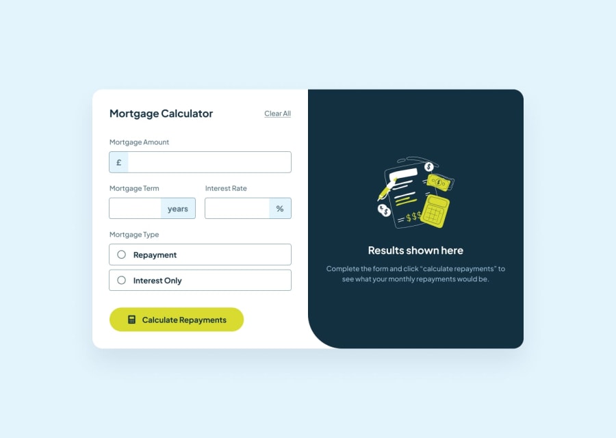
Design comparison
Solution retrospective
The thing i am most proud of is that i completed this project patiently, dividing part by part and not jumping and doing everything at a same time ,it took be around 2 days to complete the project which for me is the great deal because i don't have patience either i would jump to doing other things or drop the project.
What challenges did you encounter, and how did you overcome them?I encountered many challenges, like
- how to change the default radio button colour from blue to lime (which later found out have to hide its appearance and make custum style )
- How to set the colour of the fields to focus -how to use useContext hook
- and many more in tailwind CSS, as i only did one tailwind CSS crash course before it
I would like help in the design part with tailwind CSS. i am still struggling with responsiveness width, and height
Community feedback
- @sksksk2024Posted 3 months ago
Firstly, I hope you are good and not giving up on your web development path, @HrishiD89(2 months of not publishing any site here)!! ⭐
Secondly, I love how your structure is and the site looks solid! I see that you've encounter some difficulties with your tailwind CSS design, and based on my experience, I found that combining it with scss/sass or excluding the styles in a different file(importing it where you need) can be very helpful. I recommend the second aproach more. Ex: Let's say you have a cart.jsx file. You should put this import:
//cart.jsx
import styles from "./cart.module.css";
In order to have access to the specified file(I recommend to put them together in a folder - Cart)
//cart.module.css
.cartContainer {
  @apply flex flex-column;
}

.heading {
  @apply red-500;
}
Hope it gives you a better perspective! Be patient and take care! 🔥🔥
0
Please log in to post a comment
Log in with GitHubJoin our Discord community
Join thousands of Frontend Mentor community members taking the challenges, sharing resources, helping each other, and chatting about all things front-end!
Join our Discord
