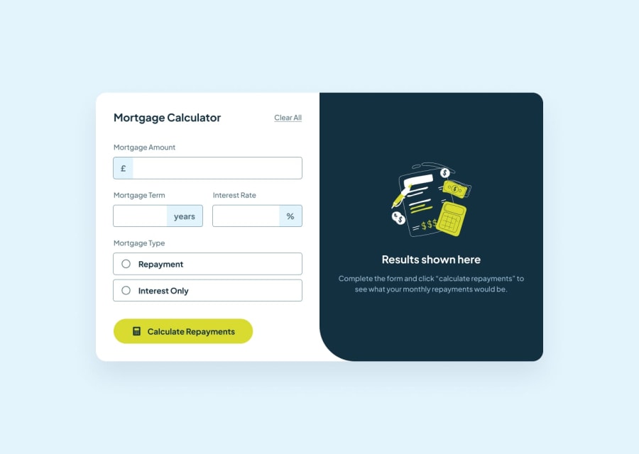
Design comparison
Solution retrospective
It's been a while since I worked with forms hence why I took up this challenge. It was certainly refreshing. Decided to even have some fun with it and added an animation and extra error messages for the error states. The animation has a timeout and reapplies every time the user tries to submit an empty or invalid form values.
What challenges did you encounter, and how did you overcome them?How to allow decimals in the number input field, using patterns, moving to the next input field using tabindex etc. Stack overflow made all this simpler for me.
What specific areas of your project would you like help with?Using commas on the amount input field and also when displaying the results. I'm still looking to this but any help would be appreciated.
Community feedback
Please log in to post a comment
Log in with GitHubJoin our Discord community
Join thousands of Frontend Mentor community members taking the challenges, sharing resources, helping each other, and chatting about all things front-end!
Join our Discord
