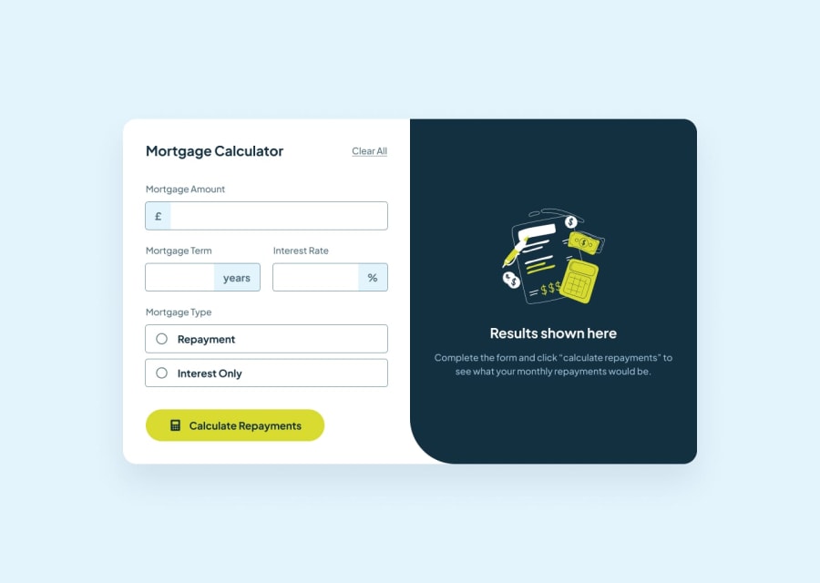
Design comparison
Solution retrospective
This was good challenge. i really like new design files, they are good structured, and comfortable for work
Community feedback
- @grgrnkooPosted 4 months ago
Good solution! Glad to see you completed it!
The only thing that doesn't fit the task is that you don't have focus states on your input. It should have a lime border and a lime background on the input decorations.
Also, your input decorations are moving up on error states, add a bit of padding and
overlay: hidden. Aaaaaand also if you want to complete it perfectly, add acursor pointeron each interactive element:)Other than that, your work is perfect. Happy coding!
Marked as helpful0@SabaMarghania1Posted 4 months ago@grgrnkoo Thank You, I am glad to hear this. but the main point for me was programming here not markup.
1
Please log in to post a comment
Log in with GitHubJoin our Discord community
Join thousands of Frontend Mentor community members taking the challenges, sharing resources, helping each other, and chatting about all things front-end!
Join our Discord
