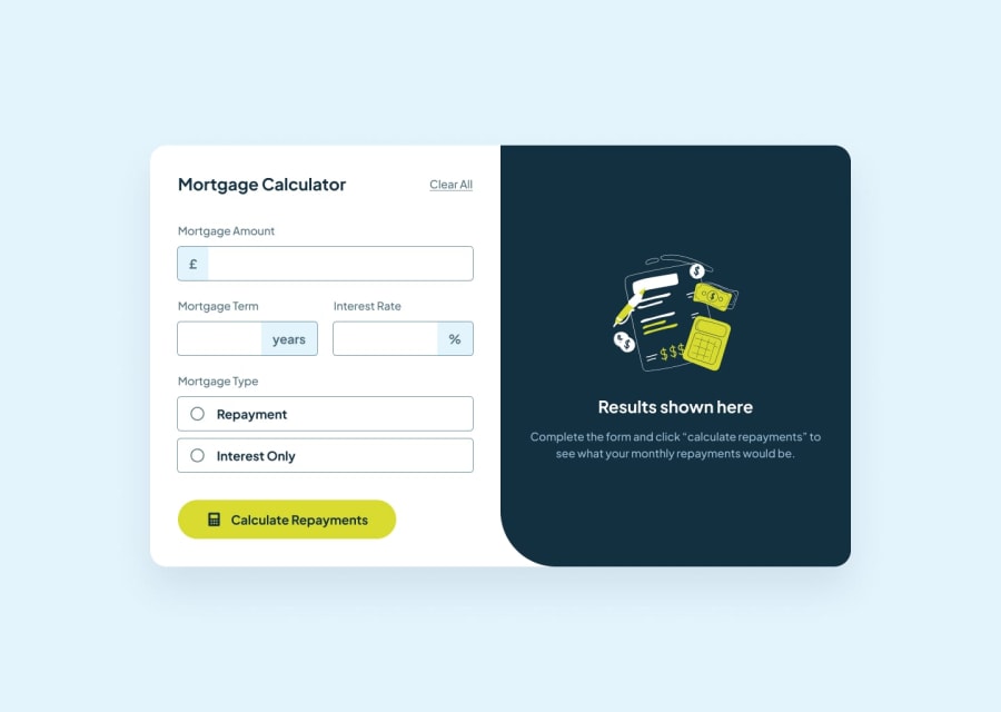
Design comparison
SolutionDesign
Community feedback
- @blakelyonsPosted 4 months ago
Looks good! I like that you added placeholders to the fields. That should have been in the design mockup! lol
1
Please log in to post a comment
Log in with GitHubJoin our Discord community
Join thousands of Frontend Mentor community members taking the challenges, sharing resources, helping each other, and chatting about all things front-end!
Join our Discord
