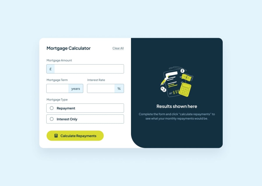
Design comparison
SolutionDesign
Solution retrospective
What are you most proud of, and what would you do differently next time?
Using the useRef hook to display the form error messages.
What challenges did you encounter, and how did you overcome them?Displaying the form error messages and becoming familiar with the useRef hook.
What specific areas of your project would you like help with?Open to suggestions.
Community feedback
- @zeynabmvsPosted 7 months ago
Hi, Some suggestions for UI:
- you can use a block-level element for error message so the height of app doesn't change when showing errors
- you can remove min-height:100vh from body, it will remove the scroll on page
0 - @progressive-newbie263Posted 7 months ago
great job mate! Lol, watching your live site actually reminds me that i forgot to do the error regex part as well as the yellow color on attribute boxes, so much appreciated ya about it
0
Please log in to post a comment
Log in with GitHubJoin our Discord community
Join thousands of Frontend Mentor community members taking the challenges, sharing resources, helping each other, and chatting about all things front-end!
Join our Discord
