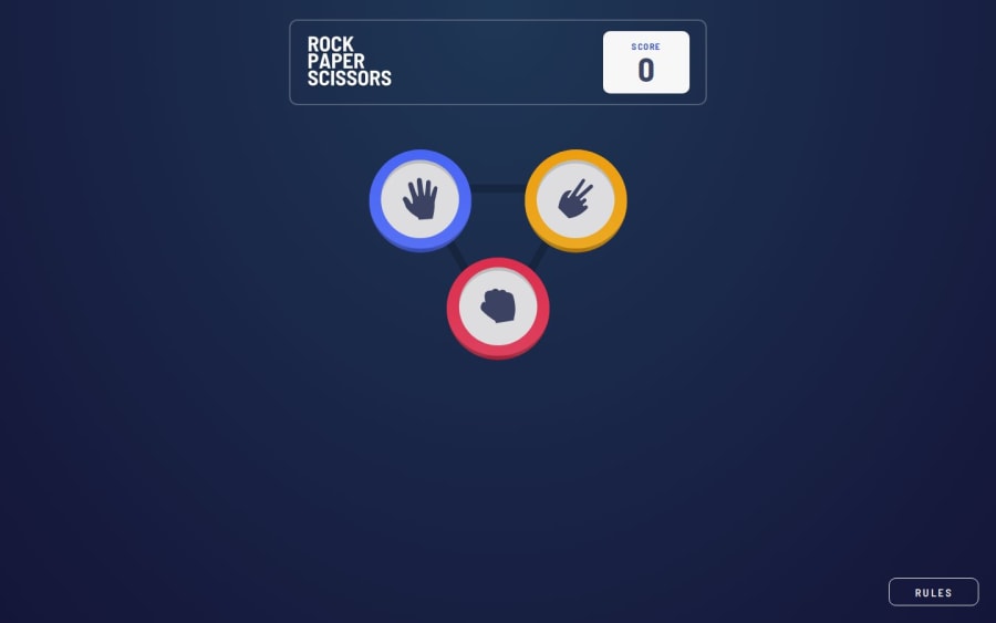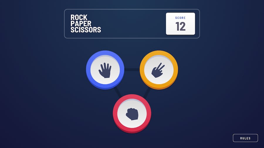
Design comparison
Solution retrospective
At first, this project seemed very daunting. I've always had trouble with CSS, so I was a bit scared looking at the design. But then I spent time breaking it down and thinking through how I would implement things one by one made it a lot easier. I learned a lot about CSS design and transitions. The logic was also a bit confusing at times, but fortunately I didn't have a lot of trouble with it.
This is also the first project I made with TypeScript. It's surprisingly not as hard as I thought. It is a bit tedious to deal with the type errors, but it's obviously better in the long run. Better fix the bugs now rather than later.
Community feedback
Please log in to post a comment
Log in with GitHubJoin our Discord community
Join thousands of Frontend Mentor community members taking the challenges, sharing resources, helping each other, and chatting about all things front-end!
Join our Discord
