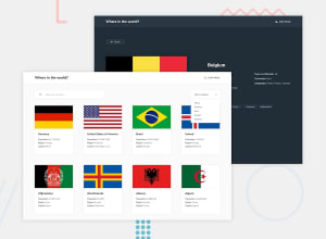
modern countries api application using vue3, with TS
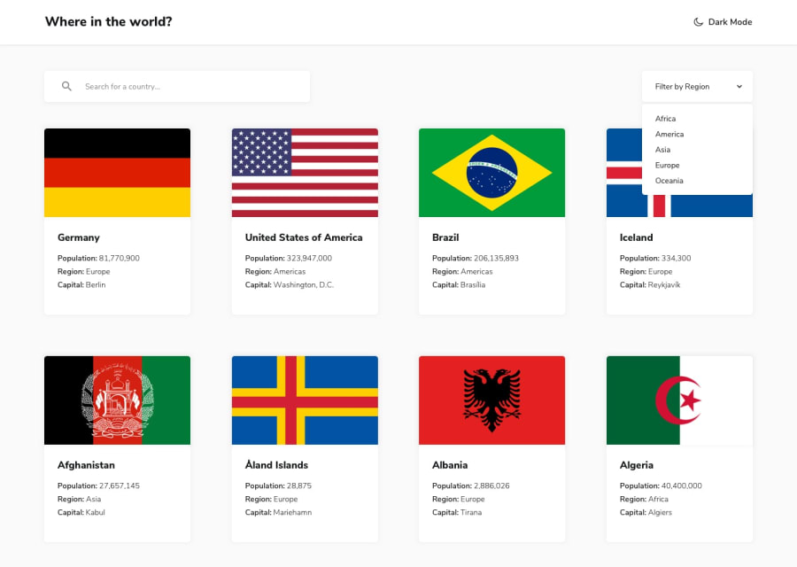
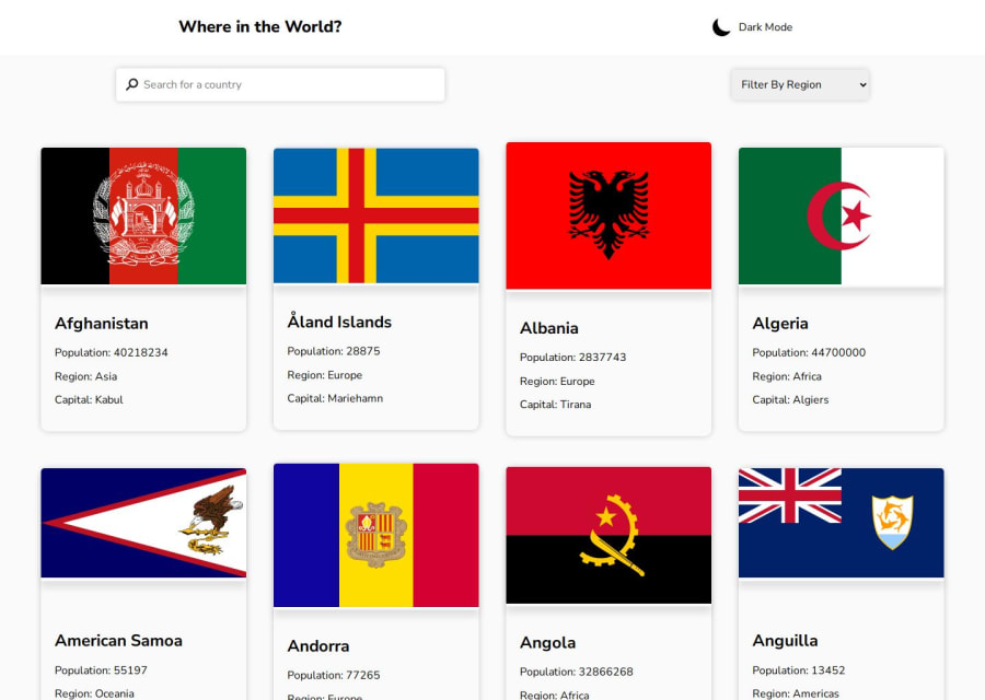
Design comparison
Solution retrospective
building a full stack project with modern stack as Vue3, Vue router4, express.js, Typescript and Scss is a good experience IMHO
What challenges did you encounter, and how did you overcome them?It is not that advanced, I consider this project at the intermediate level!
especially for full-stack developers, but for front-end ones, it is going to be a little difficult to imply restful APIs
What specific areas of your project would you like help with?learning RestFul APIs is crucial to apply such projects!
Community feedback
- @Mahmoud-ElagamyPosted 3 months ago
Great work! I encountered a few issues that could be improved:
1.The app seems to have difficulty retrieving data for countries with names containing two words separated by a space. For example, Åland Islands is not displaying any information.
2.When searching for a country in a specific region (e.g., Egypt in Asia), the app could provide a clear message indicating that the country is not available in the selected region.
3.The light/dark theme button lacks visual feedback when hovered over. Adding a cursor pointer would enhance user experience.
0@Bader-IdrisPosted 3 months ago@Mahmoud-ElAgamy thanks a lot for providing your feedback, and that's correct some URLs require more filtering and fixing, but to be honest, I did see that and was lazy about fixing it 😁
1 - @TedJenklerPosted 3 months ago
Hi @Bader-Idris,
Nice project! The shadow effect looks great. However, I noticed a few areas where you could make improvements.
Your page is responsive, but for projects like this, a grid layout would provide smoother responsiveness. While it works with flex, the card sizing seems a bit off and can look odd when placed side by side. Also, when you search for a country, the background sometimes shows two different colors—something you might want to check out.
I’d recommend looking into building custom select components since it’s an important skill for a web developer. Adding animations to the cards and select elements, along with hover effects on the children, would also enhance your project.
While your responsiveness works, there are a few breakpoints where things look off. For example, at 772px, the selected country layout could use some fine-tuning. Overall, you’ve done a great job with the border countries, and your project just needs a few CSS tweaks.
I hope this feedback helps!
Best, Teodor
0@Bader-IdrisPosted 3 months ago@TedJenkler Thanks for focusing on my work, flex and grid are both awesome, and I used flex over grid here because the set of countries doesn't require complex grid manipulation, thank you so much for being here!
1
Please log in to post a comment
Log in with GitHubJoin our Discord community
Join thousands of Frontend Mentor community members taking the challenges, sharing resources, helping each other, and chatting about all things front-end!
Join our Discord