Design comparison
SolutionDesign
Solution retrospective
Hello Frontend Mentor community 👋
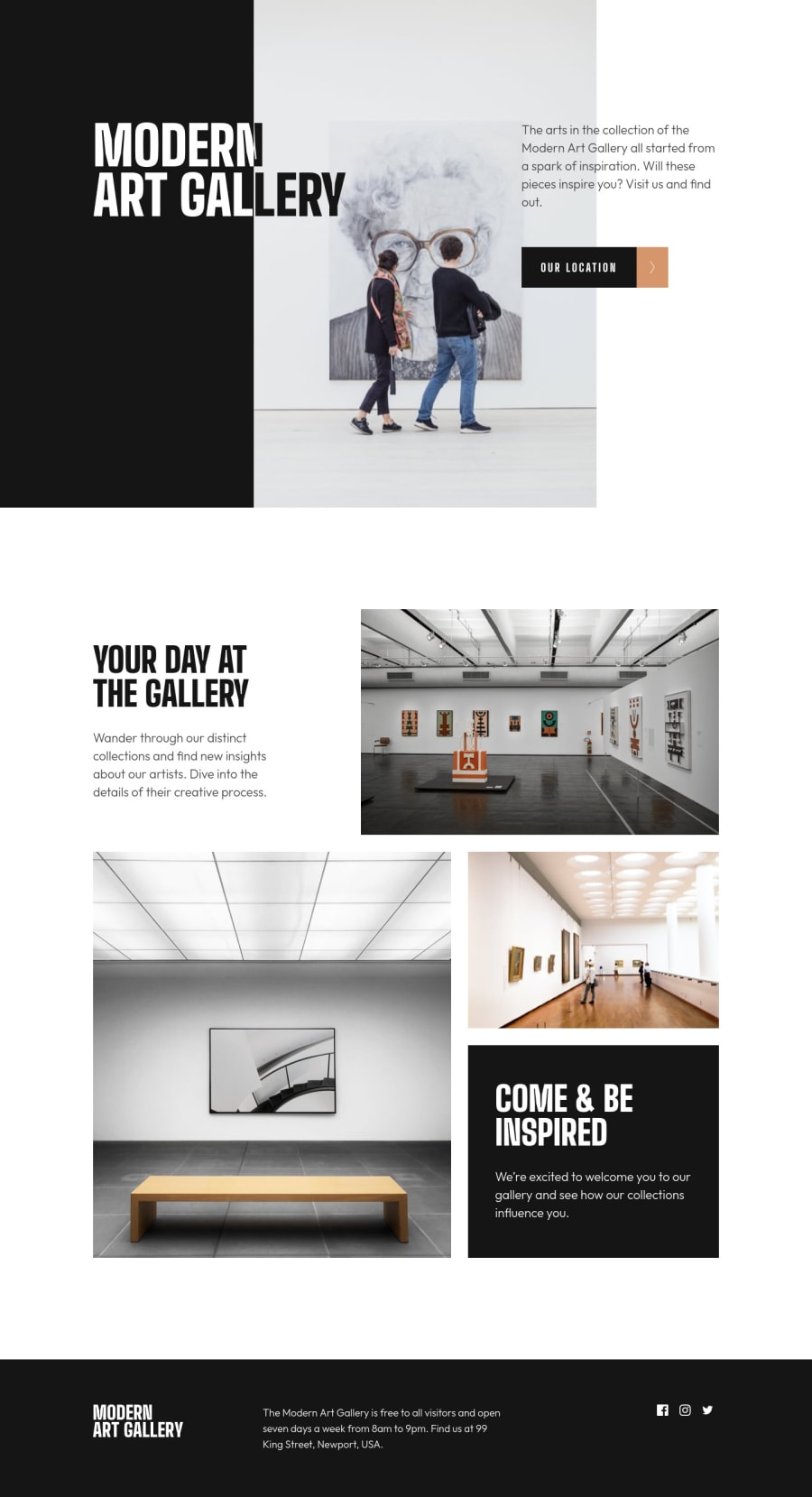
Lots of interesting elements in this challenge!
- I had fun making the title black and white and creating a hover effect on the buttons.
- The image grid wasn't hard to make using
flexbox. I guessgridwould have been more appropriate here but it's just a matter of personal taste. - I used leaflet to render the location map and marker. I tried to find a map style fitting the design, it's not exactly the same but I think it works fine.
- I generated a webfont to use the icons.
Very fun challenge overall. Any feedback is of course welcome.
Happy coding everyone!
Community feedback
Please log in to post a comment
Log in with GitHubJoin our Discord community
Join thousands of Frontend Mentor community members taking the challenges, sharing resources, helping each other, and chatting about all things front-end!
Join our Discord
