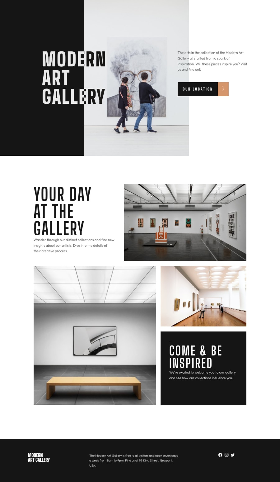
Modern Art Gallery | Responsive | CSS Grid & FlexBox Layout
Design comparison
Solution retrospective
Hey there people!
Here is probably my best project here on Frontend Mentor. I've been on this for awhile and the result is fine.
I've tried with all my knowledge to do as clean as possible the code.
Super proud of it, especially for the grid layout where I studied and improved on how to set it, the columns, the rows and the gap. Used the flex layout too, only for the mobile version.
I just changed few things from the original design (h1,h2, font-weight)
I would appreciate some feedback on it :)
EDIT: Just updated my code. I replace the old map (the image) with the "interactive" one from leaflet with js (using a tutorial, I'm still not good with js) and changed the <button> (now the Report shouldn't report any issue with the code) and its hover effect. In addition I changed the grids margins. Now it looks better, I guess :)
Community feedback
- @arfarobsPosted over 2 years ago
Hey Angelo. I'm currently working on this project myself. I like the hover effects you put on the images.
I've got a suggestion to neaten up your code with the grid images. It's not good to have three <img> tags for the same picture. This has something to do with accessibility and SEO. I spent hours looking for a solution to this. I will share it with you.
Instead of this:
<div class="mobile-grid1"> <img src="assets/mobile/[email protected]" alt="grid1"/> </div> <div class="tablet-grid1"> <img src="assets/tablet/[email protected]" alt="tablet-grid1"/> </div> <div class="desktop-grid1"> <img src="assets/desktop/[email protected]" alt="desktop-grid1"/> </div>I'd suggest using this:
<picture class="img-grid-1"> <source media="(min-width: 1440px)" srcset="./resources/assets/desktop/image-grid-1.jpg"> <source media="(min-width: 768px)" srcset="./resources/assets/tablet/image-grid-1.jpg"> <source media="(max-width: 375px)" srcset="./resources/assets/mobile/image-grid-1.jpg"> <img src="./resources/assets/mobile/image-grid-1.jpg" alt="The galleries main room."> </picture>This will avoid confusing search engines. Also, the pictures will automatically change to the correct file without adding them to your media queries in CSS. If I'm correct, I think this will also help loading speeds because the browser will only load the image that it needs, but i could be wrong about that.
Hope it helps.
Marked as helpful1@JorahhhPosted over 2 years ago@arfarobs Ow, thanks Arthur! I’ll change it with your suggestion as soon as I can.
Uhmm… what about the report above and the correct :hover on the “our location” button? Do you have a suggestion for them too?
1@arfarobsPosted over 2 years ago@Jorahhh You're welcome. I think the report above is saying that you shouldn't wrap an <a> element inside a button. What I did to get around this is to put the button within a form and specify the target url with an action attribute. Check out the following webpage.
https://stackoverflow.com/questions/2906582/how-to-create-an-html-button-that-acts-like-a-link#:~:text=The%20plain%20HTML%20way%20is,URL%20in%20the%20action%20attribute.&text=If%20necessary%2C%20set%20CSS%20display,type%3D%22submit%22%3E%20.
I'll have a look at your hover state shortly.
Marked as helpful1@arfarobsPosted over 2 years ago@Jorahhh Also, I just noticed that your hero also has three <img> tags. Id say that the hero is a decorative image, so I would put that as a background image and just change the background image's url in my media query. That was a screen reader will ignore it.
Marked as helpful1@arfarobsPosted over 2 years ago@Jorahhh With regards to the hover states, I'm not 100% sure on how to do this as I haven't got that far through the project yet. However, a quick search online suggests this method:
https://stackoverflow.com/questions/6910049/on-a-css-hover-event-can-i-change-another-divs-styling
If this doesn't work for you, let me know. I will probably finish the project this week, so i can have a better look at it when i code it myself.
What I would also suggest is using the :focus-visible psuedo element as well as hover. This allows you to style the element when people are navigating your website with a keyboard. It's good for accessibility.
https://developer.mozilla.org/en-US/docs/Web/CSS/:focus-visible
Marked as helpful1@JorahhhPosted over 2 years ago- Yep, I know. I thought about making the hero-image as background, but in the end I left it with the <img> tag.
Probably using the hero-image as background-image I could avoid making that <div> for the black squadre on the left of the desk screen too.
I should study this situation in a better way. Although I'm little scared to change something in that section, 'cause I'm super proud of that grid layout 😂
- With the :hover effects I've tried with all my (poor) knowledge about css, but I couldn't find a better way to make it as should it be. I'll check that link for sure.
And ow, I'm waiting for your solution to steal some little trick from you :P
Thanks a lot for this tips!
1@arfarobsPosted over 2 years ago@Jorahhh No worries. I've just started working on the hover states and I've opted to use JS to make it work.
1@JorahhhPosted over 2 years ago@arfarobs I guess it's the best way.
But this challenge is for HTML/CSS, so there should be a way to do it.
Probably with the :after on the same section of the button instead of putting the arrow image in the html code. And from there, make two hover effects that works simultaneously
1@arfarobsPosted over 2 years ago@Jorahhh Yeah, I suppose that would work. The challenge has a bonus for adding an interactive map and that would be impossible without using JS. So, it's a bit strange that they only made it for HTML and CSS.
Marked as helpful1@arfarobsPosted over 2 years ago@arfarobs I've just uploaded my solution. I need to tweak it a bit, but I'm too tired to do it today. Ill leave the link in case you wanna check it out.
https://www.frontendmentor.io/solutions/art-gallery-website-api-leafletjs-html-css-js-responsive-SkmwU5_f9
1@JorahhhPosted over 2 years agoYeah, I know. But you can use also the <iframe> (is it obsolete?) functions for the map without using js. By the way, I just updated my solutions with the addition of a new map and remade from zero the buttons. Now it should be better. Take a look! :D
1@arfarobsPosted over 2 years ago@Jorahhh I don't have a clue. I've only ever used iframe once and that was ages ago.
Your sites looking good mate. I really like the way you did your button.
0 - @Kl3vaPosted over 2 years ago
Your solution looks slick especially on mobile. You did pay attention to details.
1 - @shashreesamuelPosted over 2 years ago
Hey good job completing this challenge
Keep up the good work
Your solution looks great however I think the title in the website needs to wrap as seen in the design. Secondly the font size of the subtitles is supposed to be a bit bigger. Lastly the text "Come and be inspired" needs to be in a heavier font weight
I hope this helps
Cheers Happy coding 👍
0@JorahhhPosted over 2 years agoAs you can see, I wrote that I changed a few things from the original design and I was referring at the titles. I prefer them more in this style.
by the way, thank you for the feedback :)
1
Please log in to post a comment
Log in with GitHubJoin our Discord community
Join thousands of Frontend Mentor community members taking the challenges, sharing resources, helping each other, and chatting about all things front-end!
Join our Discord