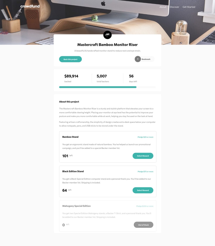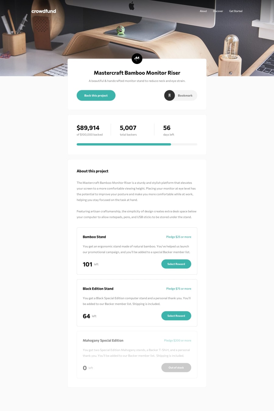
Modal screens using Finite State Machine (NOT RESPONSIVE SOLUTION)
Design comparison
Solution retrospective
Unfortunately, I dropped this project without completing the remote design because the HTML and css became so, so convoluted and a huge headache to maintain. I used far too many unnecessary divs, each with a class name which ended up making things extremely complicated. I would greatly appreciate any tips on making sure css and HTML is as simple as it possibly can be.
Another related question: should I be splitting my css files into multiple files? Scrolling up and down through hundreds of lines was very confusing, so I wondered if using multiple stylesheets instead of one big one would have solved the issue. I would also appreciate any tips for responsive mobile friendliness, as that's definitely my worst nightmare at the moment.
Community feedback
Please log in to post a comment
Log in with GitHubJoin our Discord community
Join thousands of Frontend Mentor community members taking the challenges, sharing resources, helping each other, and chatting about all things front-end!
Join our Discord
