Not Found
Not Found
Not Found
Not Found
Not Found
Not Found
Not Found
Not Found
Not Found
Not Found
Not Found
Not Found
Not Found
Not Found
Not Found
Not Found
Not Found
Not Found
Not Found
Not Found

Submitted

Mock QR Code Component

Jazzy Bonier• 10

@JakNJills

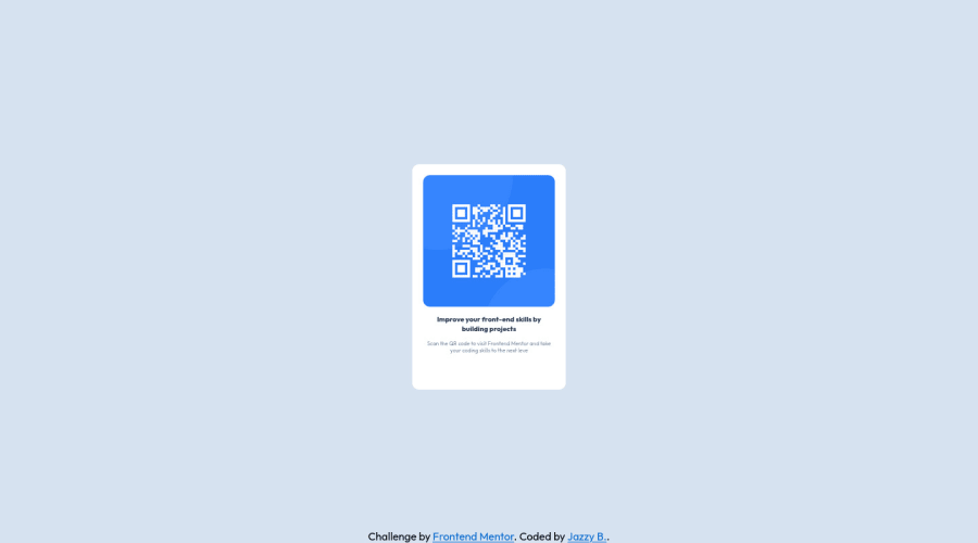
Desktop design screenshot for the QR code component coding challenge

This is a solution for...

  • HTML
  • CSS
1newbie
View challenge

Design comparison


SolutionDesign

Solution retrospective


Are there any improvements I can make to my code? I struggled with getting the sizing of the elements correct. Are there any tips and tricks to getting it just right? What are best practicings when using word wrap?

Community feedback

Hassia Issah• 50,730

@Hassiai

Posted

Replace<div class="container">with the main tag, <h2> with <h1> and <div class="attribution"> with the footer tag to fix the accessibility issues. click here for more on web-accessibility and semantic html

Every html must have <h1> to make it accessible. Always begin the heading of the html with <h1> tag wrap the sub-heading of <h1> in <h2> tag, wrap the sub-heading of <h2> in <h3> this continues until <h6>, never skip a level of a heading.

To center .container on the page using flexbox or grid instead of margin, add min-height:100vh; display: flex; align-items: center: justify-content: center; or min-height:100vh; display: grid place-items: center to the body.

USING FLEXBOX:
body{
min-height: 100vh;
display: flex;
align-items: center;
justify-content: center;
}
USING GRID:
body{
min-height: 100vh;
display: grid;
place-items: center;
}

Increase the max-width of .container and give it a padding value for all the sides. max-width:320px; padding:16px. Give the img a max-width of 100% for a responsive image instead of a width and height value.

Give .text-container a margin value for all the sides, text-align: center and a font-size of 15px which is 0.9375rem, this will be the font-size of both p and h1. Give p a margin-top or h1 a margin-bottom value for the space between the text.

Use relative units like rem or em as unit for the padding, margin, width values and preferably rem for the font-size values, instead of using px which is an absolute unit. For more on CSS units Click here

Hope am helpful.

Well done for completing this challenge. HAPPY CODING

Marked as helpful

1
Vanza Setia• 27,795

@vanzasetia

Posted

Hi, Jazzy Bonier!

About word wrapping, it looks like you are not referencing to word-break property. It's a CSS property to control word wrapping.

word-break - CSS: Cascading Style Sheets | MDN

In this case, to control the text wrapping, you should control it with the padding of the card element. You don't need to have a <div class="text-container">.

For the image sizing, I don't recommend setting both specific height when you are setting width: 100%. This can make the image get squished or stretched. So, I recommend making the image element a block element and setting max-width: 100%. That's all you need to do.

For the card sizing, remove the max-height and let the content controls the height of it.

For the other elements, you want to increase the size to make your site looks closer to the design. At the moment, your site looks smaller than the original design.

I hope these suggestions help you!

2

Please log in to post a comment

Log in with GitHub
Discord logo

Join our Discord community

Join thousands of Frontend Mentor community members taking the challenges, sharing resources, helping each other, and chatting about all things front-end!

Join our Discord