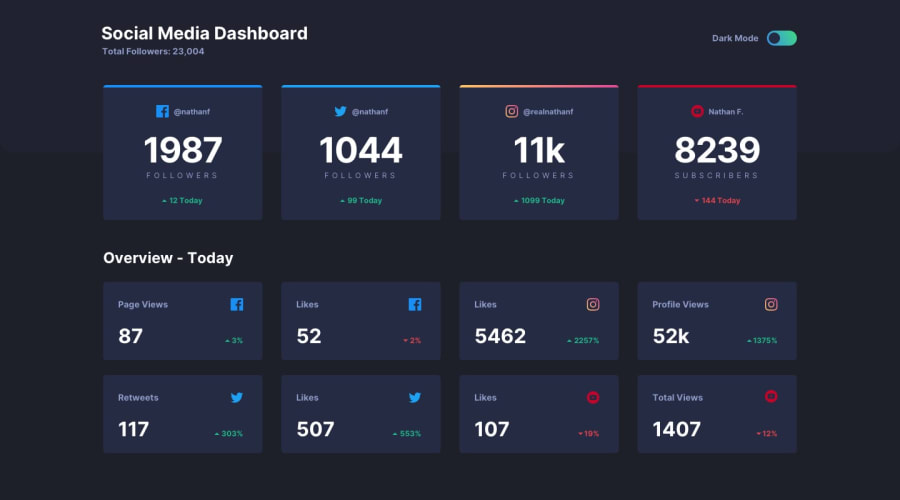
Design comparison
SolutionDesign
Community feedback
- @mattstuddertPosted over 4 years ago
Nice work on this challenge, Gursimran! You've done a really good job and you've laid out the elements really well. As you can see from the design comparison, there are just a few areas where spacings are slightly off. But that's not a huge deal.
Keep up the great work! 👍
1 - @GerbenDolPosted over 4 years ago
That's looking really nice! I'm on mobile and there's two things I've noticed:
- Alignment on the up and down arrows is a bit off
- The dark mode toggle doesn't switch position when I click directly on the toggle's circle
Thanks for your great solution!
1@Gursimran07316Posted over 4 years ago@GerbenDol hey thanks man for your suggestion i will fix that :)
0
Please log in to post a comment
Log in with GitHubJoin our Discord community
Join thousands of Frontend Mentor community members taking the challenges, sharing resources, helping each other, and chatting about all things front-end!
Join our Discord
