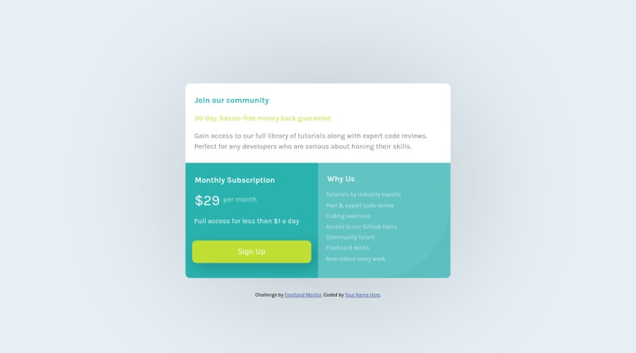
Design comparison
Solution retrospective
Any feedback would be great help
Community feedback
- @fraserwatPosted about 4 years ago
This came out really nice! The only thing I'd really change is once it gets down to quite narrow screen widths there's no space between the edge of the component and the edge of the screen. Try out a few things with margin to fix this.
0@siriusdavePosted about 4 years ago@fraserwat thank you for your relpy , I set it to the layout guild for mobile being 375px so it will not shrink low due to this . if i was make for a real site i would not do this ..
0
Please log in to post a comment
Log in with GitHubJoin our Discord community
Join thousands of Frontend Mentor community members taking the challenges, sharing resources, helping each other, and chatting about all things front-end!
Join our Discord
