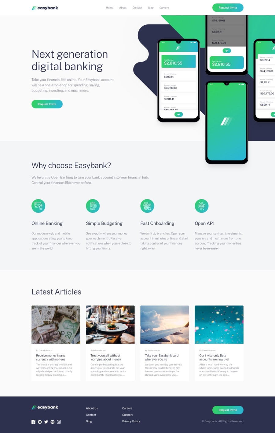
Mobile-Responsive landing page with flexbox, grid and DOM manipulation
Design comparison
Solution retrospective
My first project applying DOM manipulation. It was really cool. I, kind of, had some difficulty styling the hero images in this project.
what I did: For the mobile view, I made the hero svg a background image and the mockup, a ::before psuedo element of the same element that had the svg backgroung and that worked. In the desktop view, I had to make the mockup a html img element of its own to be able to achieve the design.
Please, If you have a better idea on how I achieved this, feel free to share... i feel there should be a better way to have done it. Your feedbacks will be really appreciated.
Community feedback
Please log in to post a comment
Log in with GitHubJoin our Discord community
Join thousands of Frontend Mentor community members taking the challenges, sharing resources, helping each other, and chatting about all things front-end!
Join our Discord
