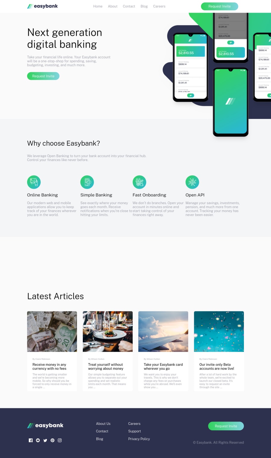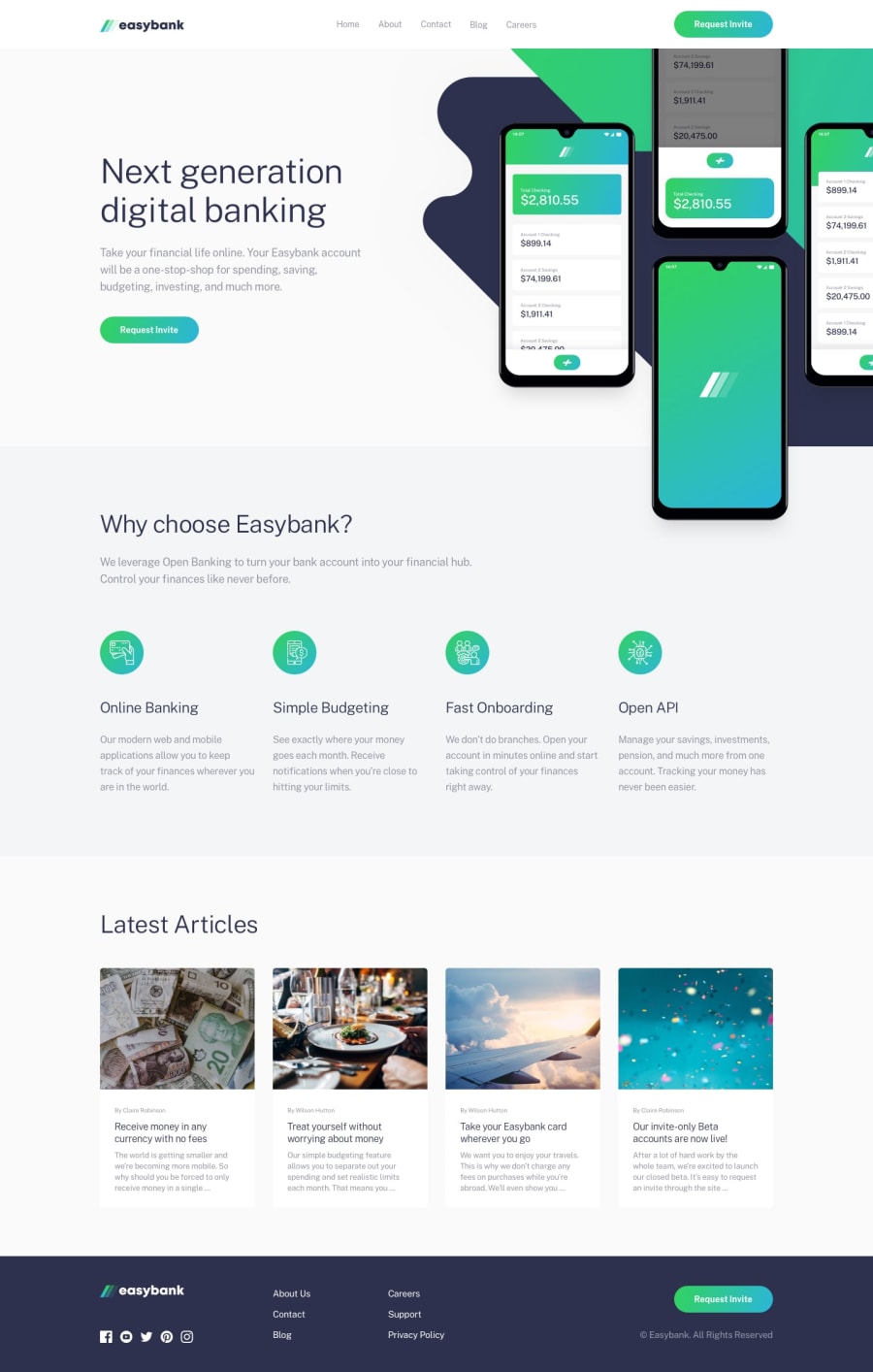
Mobile-friendly Landing page of easy bank website
Design comparison
Solution retrospective
Hello Fellow Devs 👋, Any feedback is appreciated 😁, Just finished the easy bank landing page challenge, I tried to challenge myself by completing the website using react JS, it turned out to be harder than I thought. In this project, i:
- Used ReactJS to organize the website content into multiple sections .
- Used SASS the same way to style the website.
- Made the site mobile-compatible.
I had a hard time with:
- Linking the CSS file inside the React application.
- Finding out how to preview my webpage in github pages.
- I couldn't find how to change the title of the webpage in react.
Community feedback
- @aj12-houdiniPosted over 2 years ago
Hey, great work on the project. I am learning React myself and I know it can be painful to get the organization right. A tip for making the website mobile-compatible would be to use a famous framework called Bootstrap, it really reduces the load on media queries. Also, I just noticed under your "Why chose EasyBank" section, that the content is overlapping, try to give some margin, or if you used a CSS grid try to increase the gap between them. Well done, it was a really nice project.
Marked as helpful1 - @saakarxPosted over 2 years ago
Hello AHMAD_MANA. Congrats on completing the challenge. You can change the title of the website under:
public > index.html. Hope this helps, overall the website looks great. 🙏1
Please log in to post a comment
Log in with GitHubJoin our Discord community
Join thousands of Frontend Mentor community members taking the challenges, sharing resources, helping each other, and chatting about all things front-end!
Join our Discord
