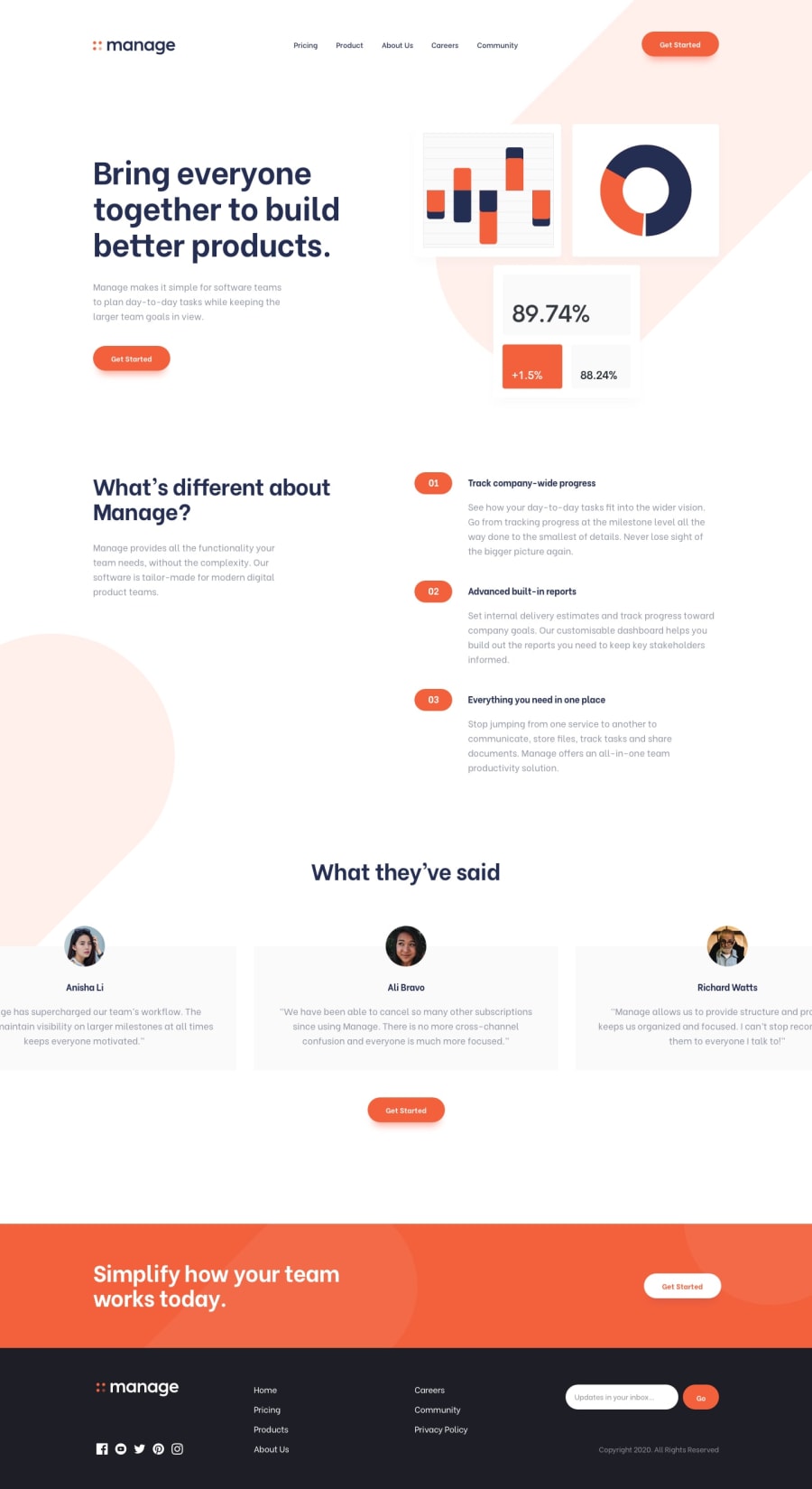
Mobile-first workflow using Sass, Flexbox and CSS Grid
Design comparison
Solution retrospective
First question - I had to use two forms for the newsletter sign-up. I then used helper classes to show the appropriate form based on the device. Is there a way I could have used one form instead of two for both mobile and desktop devices? Second question - I did a similar thing for the social icons. I edited the SVG file and ended up having two sets of files. One set of 30px icons to use for mobile and another set of 20px icons to use for desktop. I tried setting the width and height of the SVG in CSS, but that only increased the size of the SVG background instead of the actual icon. Is there a way I could have used only one set of icons then scale that up from 20px to 30px?
Community feedback
Please log in to post a comment
Log in with GitHubJoin our Discord community
Join thousands of Frontend Mentor community members taking the challenges, sharing resources, helping each other, and chatting about all things front-end!
Join our Discord
