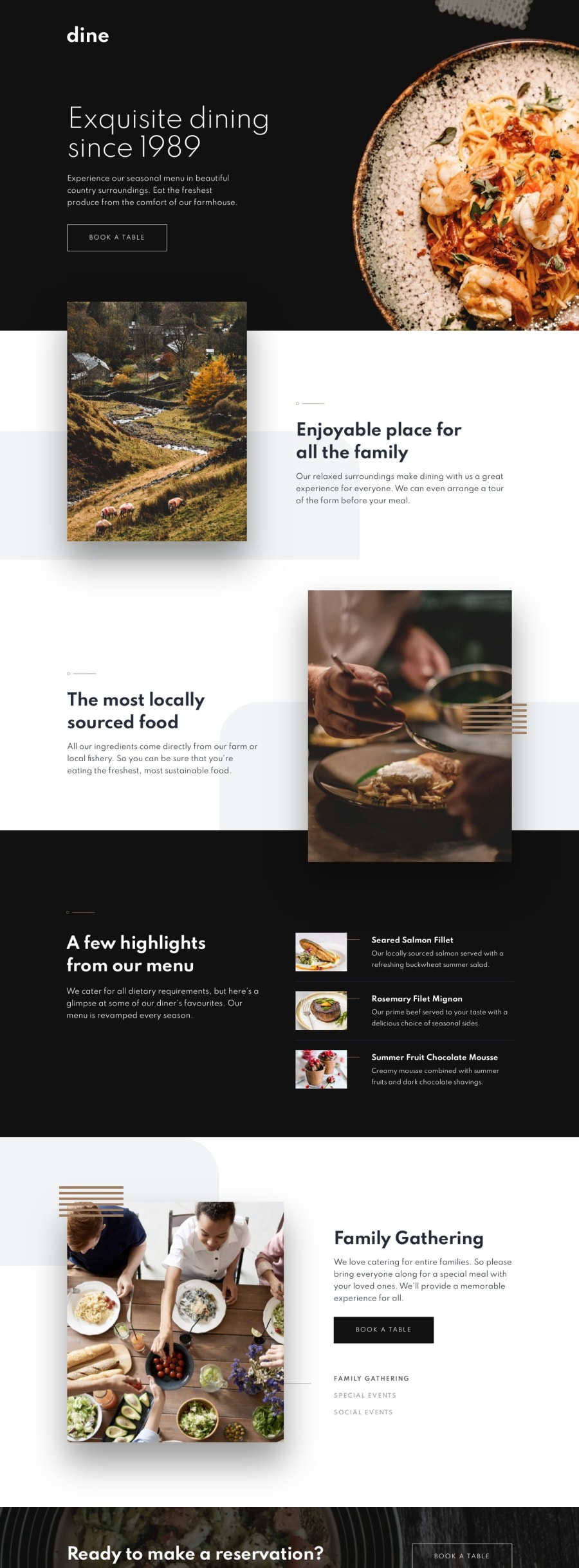
Mobile-first website using Sass, ABEM naming, JS
Design comparison
Solution retrospective
Hello! This challenge was a perfect escape from a quite exhausting JS course I've been taking at the moment. Nothing satisfies as much as seeing raw text becoming something pretty (it was a very long process though). I made a huge mistake trying to write a script changing images depending on document width, which appeared to be unnecessary, cause I could easily achieve it in HTML and CSS :D.
Thank you Matt Studdert for this amazing website and challenges. I can't believe how much progress I made in just in 2 months thanks to this website!
Anyway, there's still loads to learn, so I'm really grateful for any feedback :)
Community feedback
- @fmunivesPosted over 4 years ago
Hi Magda,
Your site looks like pretty nice!. I like too much the colors, typography, images and your responsive web design.
I would like to recommend that
you can refactor your codeto somebody can understand easily. I saw too much breakpoints and these are repeated too many times and them need an order from the minimum breakpoint to maximum. Besides, I guess you are repeating a lot of css styles and them could be reused. I think you can use atomic css to solve many similar pages and components.That's all (:
1@magdakokPosted over 4 years ago@fmunives Hello! :) Thank you for the comment! I do have a feeling I'm too messy in CSS code and still get lost when it comes to the naming part. It would be super helpful to analyse correct, clean sass code of someone savvy :)
0
Please log in to post a comment
Log in with GitHubJoin our Discord community
Join thousands of Frontend Mentor community members taking the challenges, sharing resources, helping each other, and chatting about all things front-end!
Join our Discord
