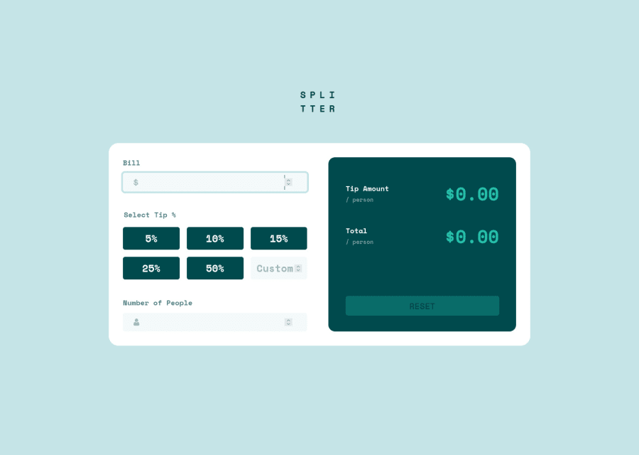
Mobile-first using BEM, SCSS, Flexbox, CSS Grid, and Vanilla JS
Design comparison
Solution retrospective
The font provided in the style guide was missing a font-weight of 500; it only had 400 and 700. Did you manage to find this missing weight?
I'm also curious what you guys used for selecting the percentages. I went through a couple and settled on a regular <button>.
Community feedback
- @Victor-NyagudiPosted about 3 years ago
I initially forgot to add the validation bit when submitting my solution. It's all good now and should be working properly.
I also made it so that you can see the totals update as you change the values.
0 - @daw22Posted about 3 years ago
hey, I like the arrows in the input fields, I think that is a good feature you added. but functionality wise I noticed somethings -> you didn't handle the zero number of people situation -> and after filling out the fields you have to click somewhere else to see the results
I would appreciate it if you share your thought on my solution https://friendly-engelbart-6ffa17.netlify.app/
0 - @Victor-NyagudiPosted about 3 years ago
I've corrected the problem causing the HTML issue in the report. It should reflect in the source code.
0
Please log in to post a comment
Log in with GitHubJoin our Discord community
Join thousands of Frontend Mentor community members taking the challenges, sharing resources, helping each other, and chatting about all things front-end!
Join our Discord
