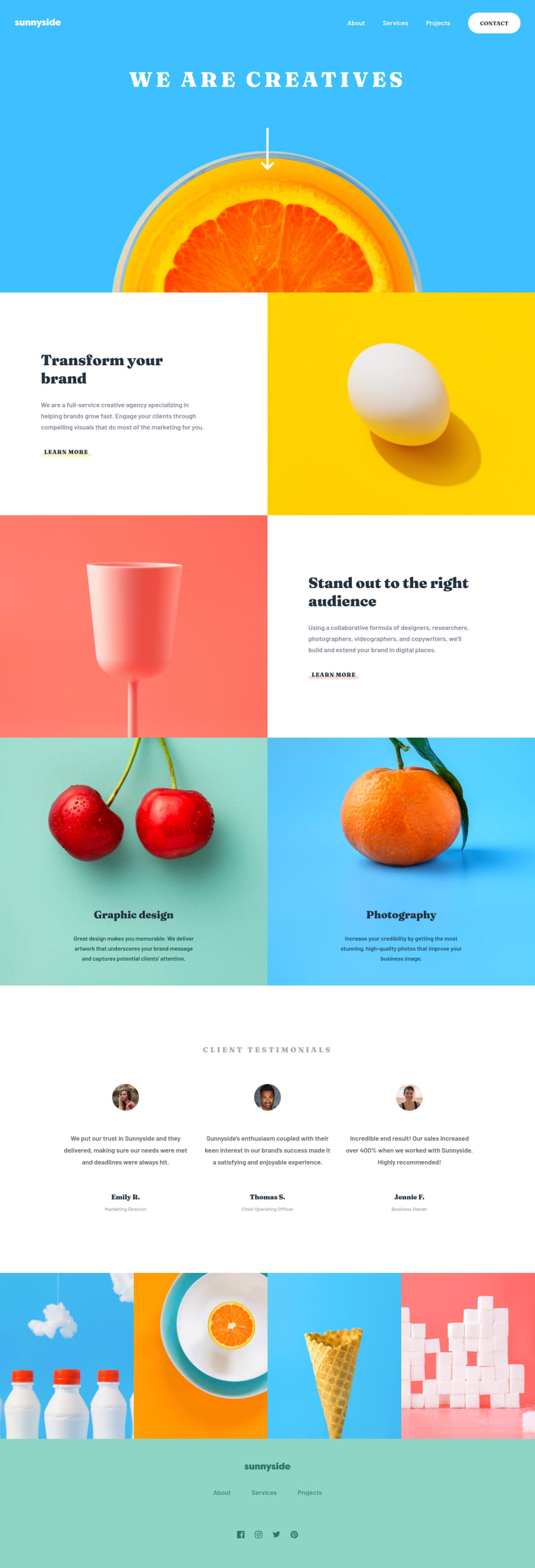
Design comparison
Solution retrospective
Really liked the design for this one, so I decided to give it a try. This challenge required some interesting things, such as choosing to either set an image as the background for a section or use absolute position to get the text in the right place. It was a little finicky, but I think it looks good across all screen sizes. Any feedback welcome!
Community feedback
- @mattstuddertPosted about 3 years ago
Hey Spencer! Excellent work on this challenge! Your solution looks great when compared to the design and scales up/down nicely 👏
I notice you've got the click event listener for the mobile menu on the hamburger
img
element. I'd strongly recommend avoiding setting click listeners on non-interactive elements, like theimg
element. These can't be accessed by anyone not using a mouse/trackpad to navigate the content, which is a bad practice. Instead, add click listeners to interactive elements likea' or
button`. This will ensure the element is focusable and accessible by people not using a mouse/trackpad.For a menu like this, I'd use the
button
element. If you want to dig deeper into accessibility with mobile menus, I'd recommend looking intoaria-expanded
and other attributes to aid screen reader users.Also, try reading out the
alt
text aloud for your images. At the moment, they don't make much sense or add context to the content. For example, in the section with four images near the bottom, screen readers will read out "milkbottles", "orange", "cone", "sugar cubes" at the moment. This doesn't add any context and would be pretty confusing. I'd say these are decorative images, so either usebackground-image
in your CSS or leave thealt
attributes blank, so that screen readers ignore them.One more thing, you're duplicating your
img
elements and hiding them based on mobile or desktop. Look into thesrcset
or thepicture
element to see how you can create responsive images in your HTML.I hope those pointers help. Let me know if you have any questions! 🙂
Marked as helpful0@spencerrundePosted about 3 years ago@mattstuddert Thanks a lot! Getting a comment from you means a ton, I love frontendmentor! I'll look into those accessibility issues, I definitely struggle with that aspect of creating websites.
picture
is new to me, but I'll make use of that from now on for sure!1@mattstuddertPosted about 3 years ago@spencerrunde, you're welcome! I'm delighted to hear you love Frontend Mentor! Keep up the great work! 👍
0 - @IEdiongPosted about 3 years ago
Hello @spencerrunde, your project is actually good. Keep it up. Happy coding.
0
Please log in to post a comment
Log in with GitHubJoin our Discord community
Join thousands of Frontend Mentor community members taking the challenges, sharing resources, helping each other, and chatting about all things front-end!
Join our Discord