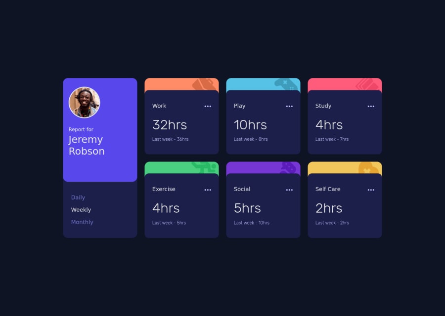
Mobile-first solution using Vanilla JS, SCSS, BEM, Flexbox, & CSS Grid
Design comparison
Solution retrospective
Did you choose to work with the JSON data provided, or did you use the information in the html
?
I'm curious about how other people approached this.
Community feedback
- @pikapikamartPosted about 3 years ago
Hey, awesome work on this one. Layout in desktop looks great, it is responsive and the mobile state looks great as well.
I haven't tackled this challenge yet but i'm planning to someday hehe, but for some suggestions, here are some:
- First, there is a warning on the console, you might want to check that one out.
- Now on the markup, you don't need to use
section
for every boxes in there, as you might noticed, the part on the left, the person's profile and the selection is a component and those 6 boxes on the right side are related components. That is why there should only be 2section
on this, first one is to wrap the person's profile and the selection or you could wrap the selection in another section, then the 6 boxes inside a singlesection
. - I notice as well some deep nesting of
div
in other section, try to avoid creating component with unnecessary elements so that the markup will be easier to maintain. - Person's
img
should be using the person's name as thealt
likealt="Emily R"
. A component like this when a person's name and image are both present, use the person's name as the value as it is a meaningful image. - The
report for
should use a more visible color, right now it is hard to see, use white on it . - Also I wouldn't wrap the
span
inside theh1
, the person's name is enough to be the value ofh1
.
This suggestion next, I already suggested just a minute ago with the same challenge so you can use this if you want:
- For the selections, since you made use of button it would be great to nest them inside a ul since those are "list" of selections and user will have an extra information on how many selections are there in the list. Also it would be great to nest that component inside a section with a screen-reader only heading tag that describes what is that section is all about. Lastly, an aria-live element that announces the changes or announces the selection has been selected, since button only does not give extra information.
- Another approach for the selections is to make those selections input type="radio"it then will be inside a fieldset along with a screen-reader only legend element that exactly do the same with the screen-reader heading I mentioned above. This way, users will get extra information on what is selected even without using aria-live element.
- Since you made the 3 dots interactive using button you should add either aria-label attribute or screen-reader element inside. The value will describe what does the button do.
img
inside the 3 dots button should be hidden since it is only decorative. Decorative image must be hidden at all times by usingalt=""
and extraaria-hidden="true"
attribute on theimg
tag.
Aside from those, great job again on this one.
Marked as helpful0@Victor-NyagudiPosted about 3 years ago@pikamart
Thanks again for the feedback!
A couple of things.
-
There's no warning for me on the console even after running the code using the live server extension in VS Code multiple times, so the issue could be on your end.
-
I chose to use a
<section>
for each of the 6 boxes on the right because even though they're related, they still have unique information with separate headings. That to me is a better approach than using<div>
that doesn't convey the right meaning. -
I also wrapped the
<span>
inside the<h1>
because this accessibility article by MDN states that the<h1>
tag should preferably be at the top of the page, if not the first thing.
This results in better organization for screen readers. Making the
report for
into a separate<p>
tag would break this rule.-
I'm aware of the nesting of
<div>
in the first section. It was a bit tricky to style without doing so, but I"ll work on improving that going forward. -
I doubt an
<input type="radio">
would work in this case because I don't think you can remove the circles for selecting an option because that doesn't sound like a good idea for accessibility, and the styling might get complicated. -
Finally, I've never seen a "screen reader only heading tag". Could you please explain it to me?
I've implemented some of the other helpful feedback you gave, so things should be better now.
Thanks again for your input!
0@pikapikamartPosted about 3 years ago@Victor-Nyagudi Hey, glad that it worked well on your site.
- Yep, the error won't fire in local server because the error in the console comes from the
styles.css:1 GET https://victor-nyagudi.github.io/images/icon-social.svg 404
error and this indicates a wrong path of a file. Since you are coding locally it won't fire error because it is using the correct path, but when deployed, that local path of thesvg
is now incorrect since it can't see the file. - Yep, but I didn't say to use
div
for each card I meant to wrap those 6 cards/boxes in a parentsection
because it is a section of it's own. - For the
span
I said that because adding thereport for
inside theh1
is not needed, only the name is needed and you are right about heading to be first that is why the markup could be:
<h1>Jeremy Robson</h1> <p> report for</p>
Then you will need to
flex-direction: row-reverse
so that it will be inversed to look like the original.For the
input type="radio"
no hahaha you won't implement it with those circles, you will make the radio button itself screen-reader only radio buttons, those text are thelabel
whilst the radio buttons are being hidden-visually, that is why you will need like asr-only
class on it which is intended for screen-readers. I haven't made a solution on this yet so I can't give a sample of it but making radio buttons does not need to always show the circles.Wait I think I have a simple snippet of this. Yep I have one, so here is a sample screen-reader only heading I put the explanation on the markup as well so that it will be easy to understand. Also that
sr-only
styling that I used is what you are going to use in the radio buttons to hide theinput
If you have any question or help just drop it here okay^^
Marked as helpful0@Victor-NyagudiPosted about 3 years ago@pikamart
I see the issue on the image path and made the change.
I see what you mean about wrapping the 6 cards in a parent
<section>
. However, each section requires a heading, and in this case, this parent tag won't have a heading.0@pikapikamartPosted about 3 years ago@Victor-Nyagudi That is where you include another screen-reader heading tag as well. Describing what the section is all about^^
1
Please log in to post a comment
Log in with GitHubJoin our Discord community
Join thousands of Frontend Mentor community members taking the challenges, sharing resources, helping each other, and chatting about all things front-end!
Join our Discord