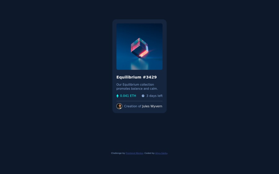
Mobile-first solution using Vanilla CSS Grid and Flexbox
Design comparison
Solution retrospective
Hi, I'm Aliyu and this is my solution for this challenge!
-
I added background image in the upper section of the component challenge instead of an <img> tag to minimize unnecessary code. Do you think I have violated the accessibility rule?
-
The size of the component card preview is same for both mobile and desktop view. Do you think the specifications of 375px and 1440px for mobile and desktop views has not been correctly answered?
Any tips or resources for general improvement will highly be appreciated!
Community feedback
- @suhaybjirdePosted almost 2 years ago
Perfect it's ok to use the image as a background i often do that
0@Aliyu-SaiduPosted almost 2 years ago@suhaybjirde Thank you. Yes it is okay to use background image in place of <img> element when the image is just there for decorative purposes! Otherwise, use the the proper <img> tag to improve the accessibility.
1
Please log in to post a comment
Log in with GitHubJoin our Discord community
Join thousands of Frontend Mentor community members taking the challenges, sharing resources, helping each other, and chatting about all things front-end!
Join our Discord
