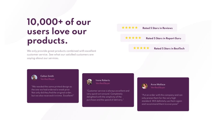
Mobile-first solution using pure HTML and CSS
Design comparison
Solution retrospective
Hello Guys! Hope you are doing great :)
It would be awesome if you guys gave me some feedback on my HTML (structure, semantic and class naming).
Thanks in advance! :)
Community feedback
- @ApplePieGiraffePosted over 4 years ago
Hey, Simon!
Your HTML looks great (and very semantic)!
I noticed that your solution switches to a mobile-friendly layout rather quickly (at around 1440px). The desktop layout will still look good (if not better) for a few hundred pixels on larger screens, provided you adjust the size of a few small things like
font-sizeorpadding(if necessary). I'd suggest you switch to a mobile-friendly layout a little bit later, when things really begin to break by resizing the screen!Otherwise, nice job!
Keep coding (and happy coding, too)!
1@simonhernandezPosted over 4 years ago@ApplePieGiraffe
Hey man!
Thank you so much for your valuable feedback. I will definitely take into account your suggestions on the media queries!
Thanks again for helping me become a better dev!
0@ApplePieGiraffePosted over 4 years ago@simonhernandez
Glad to help!
Keep it up!
😄
0
Please log in to post a comment
Log in with GitHubJoin our Discord community
Join thousands of Frontend Mentor community members taking the challenges, sharing resources, helping each other, and chatting about all things front-end!
Join our Discord
