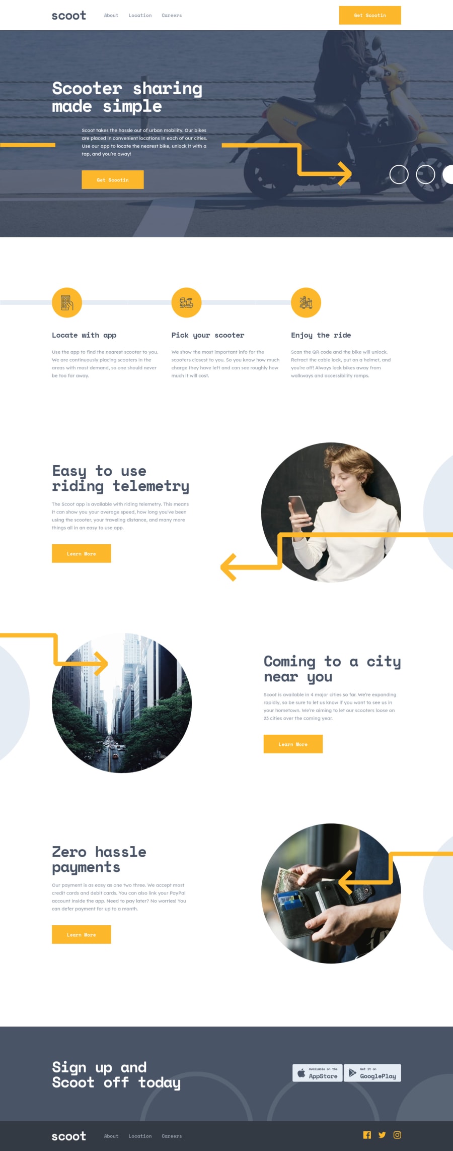
Mobile-first solution using HTML, SCSS (w/ BEM) and Vanilla JS.
Design comparison
Solution retrospective
Hi guys!
Any feedback is more than welcome and much appreciated!
Hope you guys are having a wonderful weekend and having fun coding :)
Community feedback
- @franklynwisdomPosted almost 4 years ago
This is a very nice solution. Keep it Simon. The site is very responsive.
1@simonhernandezPosted almost 4 years ago@franklynwisdom
Hi Franklyn!
Thank you so much for your feedback, I am really glad you liked it :).
Have a great Sunday and fun coding!
1 - @janez33Posted almost 4 years ago
Hello I was wondering why are you using such weird numbers for media queries and why do you repeat them every time for each section, is this a better way to keep things more organized? And why so many rems units for padding and typography - did you come up with this on your own or you imported this spacing from some library or something?
1@simonhernandezPosted almost 4 years ago@janez33
Hi Janez, Hope you are doing great!
First of all, thank you for your feedback! I will try to answer your concerns the best way I can.
-
Media Queries Breakpoints: the breakpoints I use are based on common device resolutions (640px for medium devices such as tablets; 1024px for large screens such as laptops and 1400px for those extra large screens like big monitors). In the future I will make sure to be more specific regarding the breakpoints I use (for example, setting breakpoints for extra small screens, 320px and below)
-
Media Queries Usage: I personally find it more practical to have media queries in the same place as the section styles, considering that SASS allows you to nest styles. That way you can keep both the CSS and the media queries close to each other, making it (in my opinion) easier to understand rather than having them separate.
There might be a cleaner and more organized approach to dealing with media queries that I am currently not aware of. (If you happen to know any, please let me know)
- Rem Units for Padding and Typography: the units I use are based on the design that is provided with the challenge. Although I am aware that my approach of defining spacing for different components might not be the best, as I am sure there is a more efficient and organized way to set spacing between elements. (I will definitely do some research on this).
Having said all this, I have to remark that I am just a newbie and still have A LOT to learn, which is why I deeply value your feedback, as it makes me question my own code and improve upon it.
Thanks again so much! I hope you have a great weekend and fun coding! :)
0@janez33Posted almost 4 years ago@simonhernandez Hello, thank you for explaining your way of building. I'm also a newbie but I think you put way too much effort in positioning things with rem units, margins and padding and making it looking 100% pixel perfect. You should not be wasting so much time to build pixel perfect as long as it looks good on most devices because when you will be building sites for your employe you won't have so much time. Also positioning of the cities acros world map with css is not very good for example for devices smaller than 1100px London is in France :) I think there is a library to showing data on maps, it's called D3 - you have a tutorial for it on freecodecamp.org Anyways don't stop building, everytime you build you are improving :) Regards from Slovenia, have a great weekend :)
1@simonhernandezPosted almost 4 years ago@janez33
Hello Janez, hope you are doing awesome!
Man your feedback has been very helpful, I appreciate it so much!
I will definitely take into account what you suggested about time efficiency.
The positioning of the cities location, I made them very poorly. I will definitely take a look at that positioning library you mentioned (thanks so much for sharing!)
Hope you have a great week and thanks again for helping me become a better dev!
0 -
- @ApplePieGiraffePosted almost 4 years ago
Hey, Simon! 👋
Like artimys said, awesome job! 🙌
It's nice to see a solution for a less popular (but very beautiful) challenge such as this!
All of your pages look great and respond so well! 👏
Happy coding! 😁
1@simonhernandezPosted almost 4 years agoHi @ApplePieGiraffe!
Hope you are doing great :D.
It really makes me happy you liked my solution!
Thanks for always giving me feedback on my solutions, I really appreciate it!
Hope you have a great week and happy coding too :)!
1 - @artimysPosted almost 4 years ago
Really great job on this solution. HTML is so properly commented and CSS so clean.
One thing I saw was at the 662px width. The desktop menu blends into the "Get Scoopin" button
Awesome job 👍 👍
1@simonhernandezPosted almost 4 years ago@artimys Hi Arturo!
Thank you so much for your feedback, and for pointing out that problem with the button when resizing! I will fix it asap.
Thanks again for your comments! :)
0
Please log in to post a comment
Log in with GitHubJoin our Discord community
Join thousands of Frontend Mentor community members taking the challenges, sharing resources, helping each other, and chatting about all things front-end!
Join our Discord