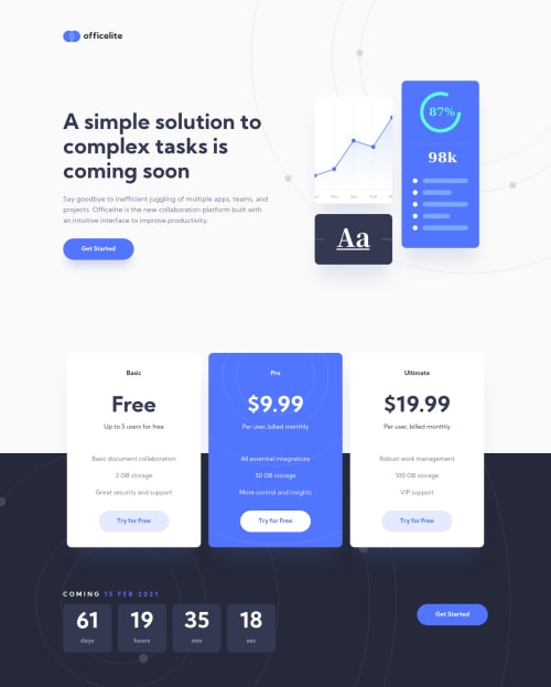
Mobile-first solution using HTML, SCSS (w/ BEM) and Vanilla JS.
Design comparison
Solution retrospective
Hi guys!
Hope you are having fun coding :)
I really liked the design of this challenge, specially the circle shapes, which I thought it was a good idea to animate them. Please let me know what you think about it :).
Wish you an awesome week :)
Pd: with this challenge, I completed my personal portfolio (linked on my profile). Please feel free to check it out. :) All thanks to Frontend Mentor :D
Community feedback
- @ApplePieGiraffePosted almost 4 years ago
Hey, Simon! 👋
Nice to see you complete another challenge! 👍 Wonderful job on this one! 👏
I really like your idea to animate the circles in the SVG backgrounds and everything else looks pretty good and responds very nicely! 🤩
Keep coding (and happy coding, too)! 😁
2@ApplePieGiraffePosted almost 4 years ago@ApplePieGiraffe
BTW, I took a look at your personal website and it looks great! The animations are really nice and the design looks good! 🙌
There's just a horizontal scroll bar which you might want to get rid of that appears along the bottom of my (smaller) desktop screen in most of the sections except for the footer. Also, adding a favicon to your site would be a nice touch! 😉
I wish you well and keep it up! 👍
1@simonhernandezPosted almost 4 years ago@ApplePieGiraffe
Hi APG, hope you are doing awesome!
Thanks a lot for your valuable feedback on both the solution and my portfolio! Also, thanks for letting me know about the horizontal scrollbar on smaller screens, I will take care of it asap, as well as creating a favicon :).
Wish you an awesome day and fun coding :)!
1 - @ElliotCasePosted almost 4 years ago
Hi Simon
Well done on the challenge the design is a replica! I personally enjoyed the animated circles, it gives a really nice touch to the page and makes it that extra bit professional.
I just noticed one thing and its when you first load the page or after refreshing the countdown times starts on "47 days 07 hours 56 minutes" then after less than a second jumps to your "61 days 18 hours" I think you might have forgotten to change it in the HTML but apart from that I think you nailed the challenge!
I also looked at your portfolio and its really inspired me to push on further with making beautiful designs for websites as you have some really great projects on there. I think my favourite is Scoot!
Happy coding keep up the good work!
2@simonhernandezPosted almost 4 years ago@ElliotCase
Hi Elliot! Hope you are doing great :)
I am really glad you liked my solution! And thanks for pointing out that issue with the countdown timer (I hadn't noticed). Will fix it asap :)
It really makes me happy you took the time to check my portfolio! Thanks a lot!!
I hope you have an awesome day, and fun coding! :)
1 - @mattstuddertPosted almost 4 years ago
Awesome work on this challenge, Simon! I love the added detail of the animated circles in the background. Nice touch! ✨
Your portfolio looks really good as well. Amazing to see so many of the premium challenges in there. I hope they help with the job hunt when it comes to getting interviews!
Keep up the great work 👍
1@simonhernandezPosted almost 4 years ago@mattstuddert
Hi Matt!
It makes me very happy you liked my portfolio! 😁 I owe it to you and your brilliant idea of creating such an amazing platform as FM! 🤩
Thanks for bringing so much value to the community!
Wish you an awesome week and fun coding :)
Pd: love the new layout!
1@mattstuddertPosted almost 4 years ago@simonhernandez you're welcome! I'm so happy that you're enjoying the platform and the challenges! 🙂
Also, great to hear you like the new layout. It's great to have them on the site. I'm excited for the next changes that I'm working on at the moment with the challenge hubs.
Enjoy the rest of your week!
1
Please log in to post a comment
Log in with GitHubJoin our Discord community
Join thousands of Frontend Mentor community members taking the challenges, sharing resources, helping each other, and chatting about all things front-end!
Join our Discord