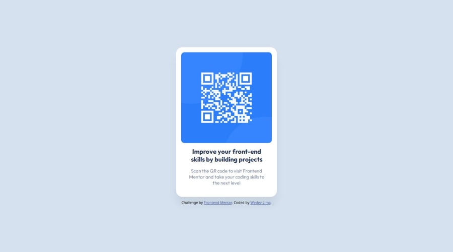
Design comparison
Solution retrospective
I'm proud about how i can solve this task without using any framework; What i would do differently next time is trust more im myself and make it done more fast.
What challenges did you encounter, and how did you overcome them?i've never use git before, so for the first try was very challenge and i got over it testing and learning more with documentation and stack overflow.
What specific areas of your project would you like help with?i think my code could be more simple and clean
Community feedback
- @shashreesamuelPosted about 1 year ago
Hey, awesome work completing this challenge. Your solution matches the design however I strongly believe that the heading text is wrapping a bit too much. Perhaps you can consider altering the width of the text.
Nontheless, keep up the awesome work
Cheers!
Marked as helpful0@webwesleyPosted about 1 year ago@shashreesamuel thank you!
After sending, I noticed about the size of the text.
I altering the width of the heading and I'm going to update the task.
0
Please log in to post a comment
Log in with GitHubJoin our Discord community
Join thousands of Frontend Mentor community members taking the challenges, sharing resources, helping each other, and chatting about all things front-end!
Join our Discord
