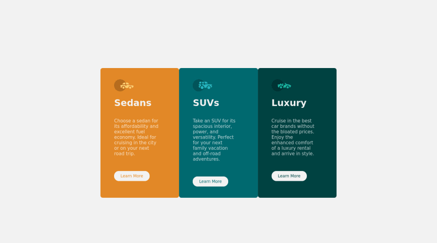
Design comparison
Solution retrospective
Hi all, 1st attempt on frontend mentor. Would be grateful of feedback on improvements in general. Found flex to be pretty easy but controlling the size and position was a lot more challenging. Look forward to some feedback on whatever jumps out at ya.
Cheers!
Community feedback
- @RickOMPGPosted over 3 years ago
Ok, just one thing that I noticed. Try to use the border-radius only in the 4 corners, use the property there and remove from the insides. In your .container, remove the padding and add border-radius and overflow:hidden to cut the edges. Awesome work, keep up learning more and more!
0@KinglizzyPosted over 3 years ago@RickOMPG cheers Luiz for feedback. Just tried adding br to .container and overflow:hidden but nothing happened, maybe I have miss understood?. If you have the time could you paraphrase what you said to see if that helps. If no time then thanks for taking the time:-)
0
Please log in to post a comment
Log in with GitHubJoin our Discord community
Join thousands of Frontend Mentor community members taking the challenges, sharing resources, helping each other, and chatting about all things front-end!
Join our Discord