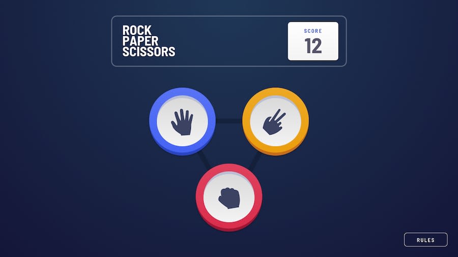
Mobile-first solution using Flexbox, CSS Grid, and Vanilla JS
Design comparison
Solution retrospective
I couldn't figure out how to display the white rings around the player's pick without nesting too many <div>s.
If you found a way to accomplish this, please let me know.
Thanks.
Community feedback
- @mattstuddertPosted about 3 years ago
Excellent work, Vicktor! Multiple box shadows would be perfect for those white rings. Here's a good CSS-Tricks article about
box-shadow.Also, at the moment, the player's score doesn't reduce when the computer wins, and the player is on zero. I'd expect it to go into negative numbers to show how far behind the player is 🙂
I hope that helps. Keep up the great work! 👍
Marked as helpful0@Victor-NyagudiPosted about 3 years ago@mattstuddert I honestly don't know why I didn't think of that.
I'm aware of multiple box shadows, but somehow, the thought never occurred to me. Thanks. I'll be sure to implement it when I can.
As for the score not going into the negative, I intentionally made it that way.
0@Victor-NyagudiPosted about 3 years ago@mattstuddert I've implemented the rings in my solution, so feel free to check it out if you wish or whenever you have time :)
Thanks again for the feedback, Matt!
1@mattstuddertPosted about 3 years ago@Victor-Nyagudi, perfect! It looks great! No worries at all, keep up the great work! 👍
1
Please log in to post a comment
Log in with GitHubJoin our Discord community
Join thousands of Frontend Mentor community members taking the challenges, sharing resources, helping each other, and chatting about all things front-end!
Join our Discord
