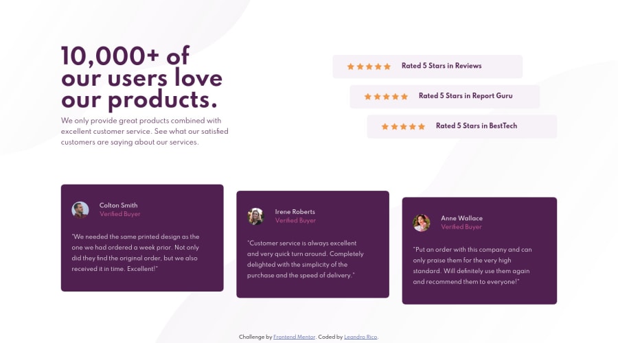
Design comparison
Solution retrospective
I think it's okay, but any feedback will be appreciated
Community feedback
- @DrKlonkPosted over 3 years ago
I like the overall feel! The responsiveness is on point.
Some things that might improve it a bit:
- I think using flexbox' align-self property instead of margins for the stacked items would make the code even more flexible.
- Same goes for flex-basis instead of the width on the elements, which I think is good practice, but this is definitely minor.
- Since there are only three elements, you could use pseudo :first-child and last-child in one ratings__review class. This is a bit cleaner than the current solution, with separate classes for each item.
- I think I would give the
<img>,<p>and<span>elements in the buyer-info a class of itself, to be able to directly access them.
I think the section and component should be separated, naming wise. I would name the section "section-ratings" and the component "rating". Have you used SASS for this? I that case, you probably used &__reviews inside .ratings (same for .testimonials), which I think should be separate. One element is part of the layout, the other is a component.
It seems like you already separate your css files, but I think there is a better way. Check out this page for how to structure files in SASS: https://www.learnhowtoprogram.com/user-interfaces/building-layouts-preprocessors/7-1-sass-architecture. I found that to be really helpful.
Have fun coding! Cheers, Joran
2@LeandroRicoPosted over 3 years agoHi! You are totally right. I keep in mind those tips for the nexts projects.
I didn't use SASS for this one. But thank's for the article, i'll read it!
And thanks for your feedback, it was really helpfull! :)
0
Please log in to post a comment
Log in with GitHubJoin our Discord community
Join thousands of Frontend Mentor community members taking the challenges, sharing resources, helping each other, and chatting about all things front-end!
Join our Discord
