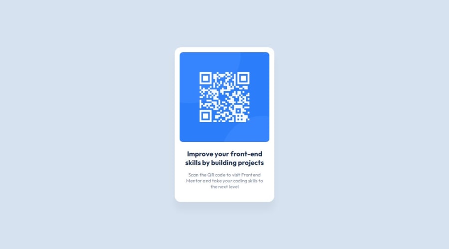
Design comparison
Solution retrospective
I'm very proud of the progress I've made in learning Git and GitHub. I didn't even know Git existed a few days ago. These tools are very useful, and I'm looking forward to developing my skills with them.
I'll make sure to use responsive instead of absolute link paths next time so I don't have to redo it.
What challenges did you encounter, and how did you overcome them?I didn't know why my image wasn't showing up on GitHub pages, the Frontend Mentor Discord Community helped me out (I was using absolute link paths).
What specific areas of your project would you like help with?Since I'm still a beginner, I would greatly appreciate it if someone could skim through my code and look for improvements related to accessibility and best practices. I want to ensure that I write as good of a code as possible.
Community feedback
- @daniel-bardaPosted 7 months ago
Hi, good job,
Since this is a fairly small project, there isn't too much to see in terms of code.
But I would recommend changing a few things in terms of best practices.
1). You used height: 100vh instead of vh, and I recommend using dvh.
There are various reasons why dvh should be used, but the main reason is that certain devices show a different result than we expect.
2). You used REM, well done. But why not use it in this case as well?
max-width: 320px; min-height: 500px;
It is no problem using px for small values, but since these are quite large, I recommend using rem for various reasons.
It is very important to remember px does not respect the user's browser font size.
(Optional) - When working with rem, I recommend that you work with a trick called the 62.5% Font Size Trick. It can be very helpful and simplify our values.
3). I'm not sure about the footer. Why did you add a div in the footer? There is no need for it.
You can delete the div, put the content directly in the footer, and apply the "attribution" class to it.
I am attaching some articles that may be helpful.
If you are curious like me you can dive deep into the latest CSS viewport units.
There is also a very detailed explanation of the behavior of vh and dvh.
2.) dive deep into the latest CSS viewport units.
I hope this was helpful. Wishing you all the best.
Marked as helpful1@moadavouPosted 7 months ago@daniel-barda Thank you so much! The 62.5% Font Size Trick will definitely make
rem
easier.The articles and they were great! I do have a question about your second point though.
I don't fully understand why I would want my containers for elements like the card to scale with the user's browser font size. Does it have to do with keeping everything in proportion to each other?
In addition to that. In the comments of the "The 62.5% Font Size Trick" article, they talked about how using
rem
for other things thanfont-size
,line-height
etc. could be a bad idea. What is the benefit of scaling most things with the user's browser font size?There were also some concerns regarding how changing the root browser font size can be bad when you use 3rd party tools or libraries. Do I have to consider these things if/when I decide to do The 62.5% Font Size Trick?
0@daniel-bardaPosted 7 months agoIt may be confusing at first.
Regarding the first question.
I provided one reason out of many why to use rem instead of px.
I provided one example since it could be quite long 😅.
Anyway, rem is the root element font size.
So I will sharpen more, the root of the document is the HTML element.
The default browser font size, is always 16 pixels unless the user does actually change it.
Let's say that the user changes the default from 16 pixels to 20, and then, of course, they would expect that would actually happen, but actually, it's not.
And so this would create huge usability problems for users.
There are more reasons why to use rem, but this is already a very deep dive.
Regarding the second question.
Let's remember what I said above.
The default browser font size is 16px.
Now it might be quite annoying to perform such a calculation every time and also the value might be quite confusing beacuse 1rem is 16px.
So let's assume we want a 500px container.
.container { max-width:8000rem; // 1rem = 16px * 500 = 8000 }
So this is where the 62.5% font size trick comes into play.
With it, we can calculate the values quite easily.
So, we do the following calculation.
10px / 16px = 0.625, which is actually 62.5%.
Anyway, now let's assume we need a container of 500px.
.container { max-width:50rem; // 1rem = 10px -> 50rem = 500px }
It really simplifies our values, and we can write values like this quite easily compared to the first time.
Another very useful thing.
When we build responsive layouts, for example, for small screens.
Instead of defining all the values again through media-query, we can reduce our html font-size, and then it will shrink our entire layout accordingly.
So now we can also see the power of rem together with the font-size 62.5%.
After all, I'll remind you again that rem is the root element font size.
So already, we have 2 very prominent advantages to the font-size trick.
It's something many developers and designers use, and to be honest, it's already an industry standard.
Regarding the last question, it's not a bad practice, the opposite is true.
You don't need to worry about third-party libraries; you need to define font size: 62.5% in the html, and everything will look like magic.
Because you defined the font-size in html, everything will be executed according to font-size: 62.5%.
It's important to emphasize that there are cases where you need to use em instead of rem, for example, in media-queries.
But that's a completely different topic.
Anyway, this topic might be a bit confusing at first, so I created a really small code to illustrate what I explained here (the code is just for basic demonstration).
I attached 3 more articles that should provide a stronger understanding.
Root Font Size to Create a Better User Experience
Use Rems for Font Size to Respect User Preferences
I hope this was helpful. Good luck on your journey.
@moadavou
1
Please log in to post a comment
Log in with GitHubJoin our Discord community
Join thousands of Frontend Mentor community members taking the challenges, sharing resources, helping each other, and chatting about all things front-end!
Join our Discord