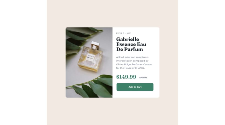
Design comparison
Solution retrospective
Accepting any criticism of my work - good or bad. Is there a way that I can do this challenge better?
Community feedback
- @Islandstone89Posted 11 months ago
Hi, let's take a look at how we can improve this.
HTML:
-
Every webpage needs a
<main>that wraps all of the content, except for<header>andfooter>. This is vital for accessibility, as it helps screen readers identify the "main" section of a page. Change.containerto a<main>. -
In this challenge you should use the
<picture>element to change images based on screen size. -
"Perfume" is not a heading, use a
<p>. And remember, headings must always be in order, so you should never start with a<h4>. -
There can only be one
<h1>on a page, so make the price a paragraph. -
A general tip: it's best practice to use classes instead of IDs.
-
.attributionshould be a<footer>. -
Footer text needs to be wrapped in a
<p>.
CSS:
-
It's good practice to include a CSS Reset at the top.
-
Another general tip: it's convention to name your CSS file
style.css. -
font-sizemust never be in px. This is bad for accessibility, as it prevents the font size from scaling with the user's default setting in the browser. Use rem instead. -
Remove the
htmlselector, you only need to set properties on thebody. -
The
background-colormust be put on the body, that will fix the white space you currently have on either side. -
bodydoes not needwidth: 100%- it is a block element, hence it is 100% wide by default. Also, remove theheight. -
Add the following properties to the
body:
flex-direction: column; align-items: center; min-height: 100vh;-
max-widthon the card should be in rem, and should be smaller. Open DevTools and experiment with the "Responsive" mode to find a suitable breakpoint. -
Remove all fixed widths and heights. They are, 99% of the time, a big no-no.
-
Media queries must be in rem, not
px.
Marked as helpful0@harvmjonesPosted 11 months agoThank you so much for the feedback. This information was very helpful.
1 -
- @kimodev1990Posted 11 months ago
Really Great work in completing the challenge, Just a few feedbacks :
- To center your container, no need to use
padding: 175px 420pxin container, You could add in body :
display: flex ;
justify-content: center ;
align-items: center ;
min-height: 100vh ;
and the container under body will be centered in the middle of your website.
- You could add
background-color: var(--cream-bg)to body instead of container to cover the whole page similar to the desired design. - Other way to change images according to the design layout is to use picture tag :
<picture>
      <source media=" ( max-width:991.5px ) " srcset="./images/image-product-mobile.jpg>
      <img  src="./images/image-product-desktop.jpg" alt="#">
</picture>
and depending on @media, the image changes. No need to add display: none ;
Hope you find this Helpful.
Other than that, Really Nice work & keep Going on.
Marked as helpful0 - To center your container, no need to use
Please log in to post a comment
Log in with GitHubJoin our Discord community
Join thousands of Frontend Mentor community members taking the challenges, sharing resources, helping each other, and chatting about all things front-end!
Join our Discord
