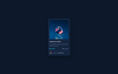
Design comparison
Solution retrospective
Is there a better way to size the icons rather than manually selecting a height and width in pixels?
Is there a better way to shrink the elements for the desktop view rather than manually changing the font/ height and width of each one?
Community feedback
- @MohamedAridahPosted over 2 years ago
@tbrownlee I'm glad this was useful for you🌹👍. you can read more about pseudo elements from Here.
- Yes, you can change the icon size by using
background-size
property.
.interactive::after { background-size: 55px; /* you can use percentage % as well */ }
You can read more about it from Here.
Keep Coding🚀
Marked as helpful1@tbrownleePosted over 2 years ago@MohamedAridah ok thank you! I'll check out those links
0 - Yes, you can change the icon size by using
- @MohamedAridahPosted over 2 years ago
Hello @tbrownlee, you did Good job. and Your solution is Also Responsive.👍👏 it seems quite small to me but its ok.
I have some notes for you:
- inside
.interactive
div instead of using.interactive-overlay
and.interactive-icon
. You can use pseudo element instead Your way is totally right but you can try the following:
.interactive::after{ content: url(./images/icon-view.svg); position: absolute; background-color: rgb(0 255 247 / 45%); width: 100%; height: 100%; opacity: 0; top: 0; left: 0; display: flex; align-items: center; justify-content: center; cursor: pointer; border-radius: 1rem; overflow: hidden; transition: .3s ease; }
.interactive:hover::after{ opacity: 1; }
-
instead of using
<hr>
tag you can useborder-top
orborder-bottom
depending on the div you will use it. Also this is more Semantic -
use
<a>
element instead of span for author name. It's more Semantic and on click this name this may lead to another page. -
you can see My solution for this challenge it may be helpful for you..!
I hope this wasn't too long for you, hoping also it was useful😍.
Goodbye and have a nice day.
Keep coding🚀
Marked as helpful1@tbrownleePosted over 2 years ago@MohamedAridah I totally missed the <a> element for the author, thank you!
In the future, I'll set my width to be 330px like you did as that seems to be what Frontend Mentor uses.
The ::after method seems to be a much better way of doing things as I wouldn't have an empty div purely for styling purposes. I noticed you used the background-color property to style the "overlay" opacity and used the opacity property to make .interactive::after appear/ disappear.
Also, is there any way to change the size (width/height) of the icon-view image via this method?
Thank you for taking the time to review my code, always trying to have better solutions!
0 - inside
Please log in to post a comment
Log in with GitHubJoin our Discord community
Join thousands of Frontend Mentor community members taking the challenges, sharing resources, helping each other, and chatting about all things front-end!
Join our Discord