Not Found
Not Found
Not Found
Not Found
Not Found
Not Found
Not Found
Not Found
Not Found
Not Found
Not Found
Not Found
Not Found
Not Found
Not Found
Not Found
Not Found
Not Found
Not Found
Not Found

Submitted

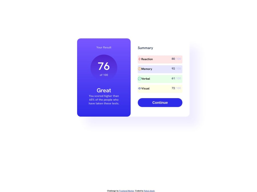
Mobile-first solution using CSS Grisd and Flexbox which is responsive.

Rahul sheshβ€’ 120

@RahulShesh

Desktop design screenshot for the Results summary component coding challenge

This is a solution for...

  • HTML
  • CSS
1newbie
View challenge

Design comparison


SolutionDesign

Solution retrospective


I faced lot of difficulties for the perfect size for all components, because sizes are not mentioned.

Community feedback

Tushar Biswasβ€’ 4,080

@itush

Posted

Congratulations on completing the challenge! πŸŽ‰

Welcome to the platform! πŸŽ‰ We're thrilled to have you here and excited to see your progress πŸ’ͺas you continue your front-end development journey.

Nice attempt :)

  • The challenge tests how accurately you can replicate the design without Sketch and Figma design files.

  • To make it mobile responsive it is important to first understand how different breakpoints work with the media queries, which breakpoints to target etc.

In my projects:

  • I always start with mobile-first workflow.
  • I use at least one main element for a page (entire content goes into the main, if I'm not using header & footer), and avoid divs as much as possible and use section and article element wherever I can.
<body>
<main>
All content 
</main>
</body>
  • I Use relative units as much as possible and avoid absolute units whenever possible.

  • If you are someone who is just starting out with front-end development, I strongly suggest starting with the QR code component project. Also in the challenges page you may filter by (Newbie, HTML&CSS) sort by (easier first) to select projects that will help you solidify your foundation. To avoid any potential knowledge gap⚠️ please first solidify HTML, CSS, JS fundamentals and then move on to any framework or library.

  • I remember when I started out, I made countless mistakes and spent long hours searching for solutions. But hey, you don't need to go through the same struggles! πŸ™Œ To help you shorten the learning curve, I recommend going through the following articles. They contain valuable insights that can make your journey smoother:

πŸ“šπŸ” 12 important CSS topics where I discuss about css position, z-index, box-model, flexbox, grid, media queries, mobile-first workflow, best practices etc. in a simple way.

πŸ“šπŸ” 11 important HTML topics where I discuss about my thought process and approach to convert a design/mock-up to HTML along with important topics like block and inline elements, HTML Semantic Elements.

I hope you find these resources helpful in your coding adventures! 🀞

I'm eagerly looking forward to seeing the amazing projects you'll create in the future! πŸš€πŸ’»

Keep up the fantastic work and happy hacking! πŸ’ͺ✨

Marked as helpful

0

Please log in to post a comment

Log in with GitHub
Discord logo

Join our Discord community

Join thousands of Frontend Mentor community members taking the challenges, sharing resources, helping each other, and chatting about all things front-end!

Join our Discord