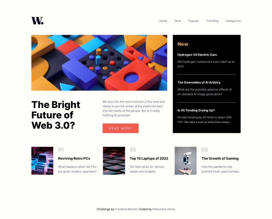
Mobile-first solution using CSS Grid and BEM naming approach
Design comparison
Solution retrospective
Hi everyone! This is my first challenge with the Frontend Mentor platform so I would appreciate any feedback on how to improve my code. I'm especially interested in your thoughts about the way I implemented the BEM naming approach (I'm using it for the first time and am unsure whether I got it right). Thanks in advance))
Community feedback
- @Aimal-125Posted almost 2 years ago
In your css code, give .navbar__dropdown_menu class
height: 100%;instead of 100vh. When i click on the menu button the dropdown is only 100vh and not reaching its full height relative to the container on my j3 mobile device.Marked as helpful1@RoksolanaVeresPosted almost 2 years ago@Aimal-125 thank you for your advice. With height: 100% it definitely looks better)
0 - @javascriptor1Posted almost 2 years ago
Hi Roksolana ,
Nice work. Here is my feedback on your solution :
- The section under comment spans into 2 lines on large screens. You should align all 3 on the same line.
- It's better to use semantic element <nav> for the navigation menu - I forgot it myself in the solution I submitted today :).
- Wrapp all li in <ul> element.
- Enlarge text size for the word New and headings beneath it. I did not use to mention such things in my feedback, but because your solution is almost identical to the design, I think it would be great to correct it. I would like to know how did you get this much close to the design and what is your screen size?
Marked as helpful1@RoksolanaVeresPosted almost 2 years ago@javascriptor1 , thanks for your feedback, it was more than helpful) I just need to clarify your first comment: are you talking about the next articles section? if so, I checked it on 1440px screen size, and at this exact size, all three sections are in the same line. As for the smaller screen sizes, I intentionally made them span into 2 lines whenever the screen shrinks. As for the other comments, they make perfect sense :) I use this Picpick App (https://picpick.app/en/ ) to measure the distances between the elements and their actual sizes. There is also a color picker that helps you to choose colors identical to the design. You don't need to buy it, the free version is more than enough. My screen resolution is 1920 x 1080, but I also have 125% scale in the OS.
0@javascriptor1Posted almost 2 years agoHello @RoksolanaVeres ,
Here is a screenshot for the section I was referring to : screenshot.
Thanks for sharing the app you've been using for sizes. I will give it a try.
I use the PowerToys windows 10 for such things. It has a screen ruler and color picker as well. I use it also to split my screen into required divisions to move between screens easily.
What I really don't understand well is how to scale down the sizes on the screen of width 1440px to my screen size 1366px.
Say I have a Figma file designed for screen 1440px just like all chellenges here at FEM. Even if I have the Figma file, the sizes won't match with my screen size. For example, if the logo is far 120px from the nav bar on 1440px, I can't apply the same distance on my screen.
So I really don't know how or what is the best solution for this.
Thanks and keep coding.
0@RoksolanaVeresPosted almost 2 years agoHi Mohammed,
It seems that because of the different screen resolutions we see different results. I mean, on my screen with a width of 1440px the layout looks like this: screenshot
I've noticed that you applied the same size on your screen but it really looks different.
Unfortunately, I have no idea how to fix this problem((
1
Please log in to post a comment
Log in with GitHubJoin our Discord community
Join thousands of Frontend Mentor community members taking the challenges, sharing resources, helping each other, and chatting about all things front-end!
Join our Discord
