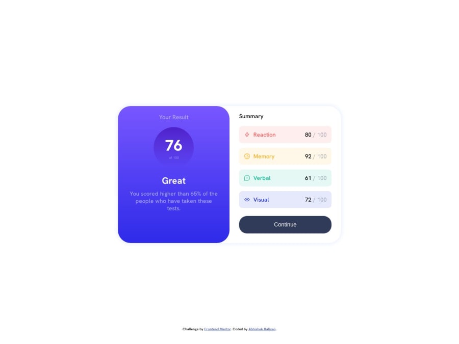
Mobile-first solution using CSS flexbox
Design comparison
Solution retrospective
I was unable to find a solution for vertical/horizontal centre alignment without assigning height in css. Is it compulsory using height when alignment vertical/horizontal ?
Any suggestions on how I can improve are welcome!
Community feedback
- @DennardavidPosted about 1 year ago
To do the vertical and horizontal alignment you can use flex box set the body to a height of 100vh and align items center and justify content center this would do the trick e.g of the code
body {
   display: flex;
   Justify content: center;
   align items: center;
   height:100vh;
}
Marked as helpful0 - @DennardavidPosted about 1 year ago
On the mobile view there is an initial margin this can be removed by setting the root margin to 0 like this
* {
    Margin:0;
   }
Marked as helpful0@abhishek-baliyan-devPosted about 1 year ago@Dennardavid Thanks. I didn't know about this.
0@MelvinAguilarPosted about 1 year ago@abhishek-baliyan-dev Hello, regarding your question :
Yes, when aligning an element both vertically and horizontally, using a height value is essential. This is because height defines the reference point for the centering process. Without a height, there wouldn't be a clear reference point for the center alignment, making it more challenging to achieve the desired layout.
Marked as helpful1
Please log in to post a comment
Log in with GitHubJoin our Discord community
Join thousands of Frontend Mentor community members taking the challenges, sharing resources, helping each other, and chatting about all things front-end!
Join our Discord
