Design comparison
Solution retrospective
Hello everyone, this is my very first Frontend Mentor solution.
I tried to focus every detail on design as well as I could, and write well structured simple, easy to read code.
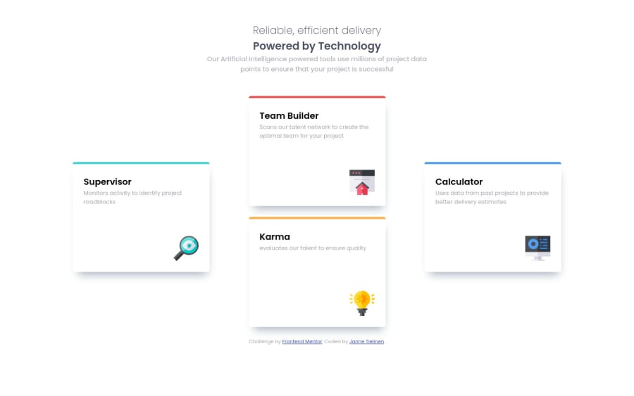
Is there simpler, or best-practises to place elements right/bottom corners of their containers? Like images are in this solution.
What is the best way to place info-cards to "cross" formation on desktop screens?
Where you think I did good? What one thing you would change in my code, why, and how?
Thanking in advance Janne
Community feedback
- @grace-snowPosted over 3 years ago
Hi @Tielinen,
Ideally this is a CSS grid challenge, not flexbox (for the card grid). You're solution would have less HTML and be simpler to manage if you used CSS grid.
If you want to keep using flex as you have done, it's still valid and fine to do, just a suggestion really 🙂
It would be better with your flex grid if you used this approach:
.info-cards-container { max-width: 1110px; // instead of width gap: 1.5rem; // or however much gap you want to use align-items: center; // removes need for auto vertical margins on two cards targeted by IDs }
I don't think you need to give the cards an exact width and height at any breakpoint.
How you've positioned the images looks fine to me. Alternatives could be
- making them background images (card would need a min-height and a load of padding at the bottom to prevent overlap if extra text was ever added in future)
- positioning image absolutely (card would need position relative, and all the first bullet points properties apply)
- image could be set to display block, with margin-left auto
- image could be placed inside a block element that has text-align: right;
Those images don't need alt text though. Leave the alt blank like
alt=""
and addara-hidden="true"
It's really important for font-sizes to not be in pixels but use a relative unit, preferably rems. This allows the font sizes to scale predictably with user preferences. I would also use rems for things like widths, padding/margin and media queries, but that is more down to personal choice I think.
The only other very minor things are that the card heading text color doesn't seem to match the design, and 1110px is very late to be triggering that desktop design. I think there's room for your media query to kick in sooner.
Overall, really great work on this. Your HTML and CSS are well written and easy to understand, and the result looks good 👍
3@TielinenPosted over 3 years agoThank you, @grace-snow! You gave me some valuable advices. I changed
.info-cards-container
to grid, and it seems that I have to spend some time to get my grid knowledge to better level.I followed (almost) all advises you gave, especially thank you for pointing out about font-size units.
Again, thank you for your advises and taking time to comment my code.
Best wishes Janne
0 - @MarkoNikolajevicPosted over 3 years ago
Hi Tielinen,
your first solution looks really good and the code is clear and readable! Nice done! :)
- to place images on the right bottom you could set
position: relative
on theinfo-card
class and remove styles you add on<div class="image-container">
and add these styles on it
position: absolute; bottom: 0; right: set the value equals to the left padding of the card;
- one more thing, you start using
h2
and go down toh3
, I would suggest you to start withh1
and then move down toh2
etc
Anyway everything looks good!
Keep coding :)
1@TielinenPosted over 3 years agoHi @MarkoNikolajevic, Thank you for your comment.
I implemented absolute positioning strategy. It's is simpler and more straightforward style to place images than my original solution. I had to do some reading to understand why and how suggestion works to way it does.
I removed
div.image-container
as unnecessary and placed image elements absolute.Thank you for your advice and taking time to comment my code.
Best wishes Janne
1 - to place images on the right bottom you could set
Please log in to post a comment
Log in with GitHubJoin our Discord community
Join thousands of Frontend Mentor community members taking the challenges, sharing resources, helping each other, and chatting about all things front-end!
Join our Discord