Design comparison
Solution retrospective
Please provide feedback or Please tell me how I can improve
Community feedback
- @kdumagalhaesPosted over 4 years ago
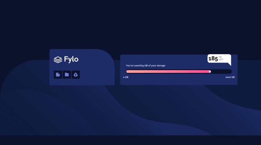
I've found some details that I think it would be easy to solve! (at least in pure CSS3)
1 - In "You've used 815 GB of your storage", you should only put the "815 GB" on bold;
2- The containers are misaligned (at least in my screen);
3 - In the baloon (815 GB Left) you should put the text inline;
4 - The upload icon is deformed;
I don´t know if you are a begginer like me, but if you are, try to use pure CSS3 instead of using CSS frameworks for now. It´s helping me a lot to understand things and how frameworks works haha.
Ah, congrats! =)
1 - @jovannickovicPosted over 4 years ago
Well, your body clearly doesn't take the whole screen size vertically as I can see so your background image doesn't go all the way to the bottom of the screen. A quick fix would be to avoid using px for margin-top on div.container-fluid and use vh instead.
0
Please log in to post a comment
Log in with GitHubJoin our Discord community
Join thousands of Frontend Mentor community members taking the challenges, sharing resources, helping each other, and chatting about all things front-end!
Join our Discord
