Design comparison
Solution retrospective
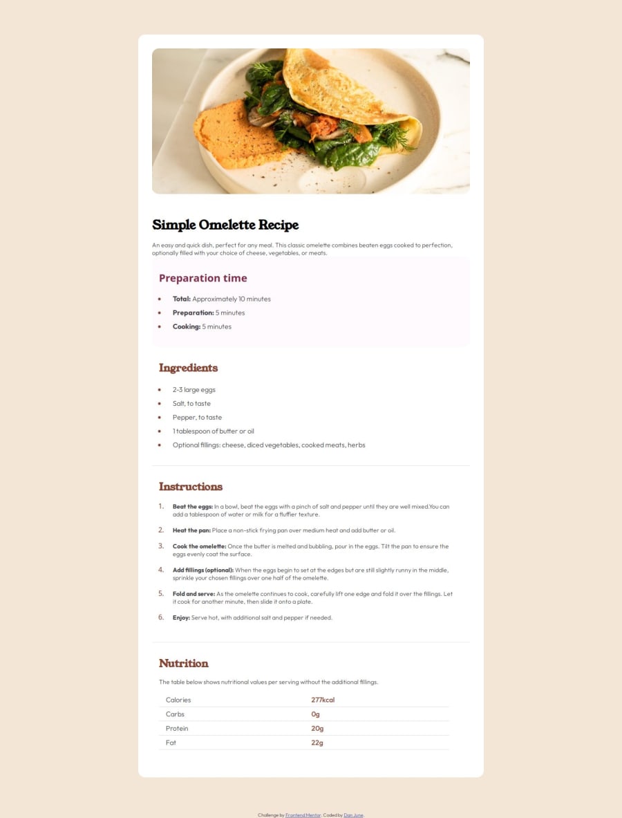
The image adds the border radius just as it pulls from the edge of the page and the overall flow between the media breakpoint.
I would have tried to match the colors exactly, but was not using the free access and didn't have the Figma files to pull the exact colors. I could not tell from the image what was being used for body text or what font was being used for the ordered list numbers as it doesn't seem to be either of the provided fonts in the folders.
What challenges did you encounter, and how did you overcome them?I was having some issues with getting the headings to line with the markers instead of the li text, so I adjusted this with a negative rem margin-left to allow that to line up.
What specific areas of your project would you like help with?I would like suggestions on how to correct the alignment on the sections without needing to use the negative margin.
Community feedback
Please log in to post a comment
Log in with GitHubJoin our Discord community
Join thousands of Frontend Mentor community members taking the challenges, sharing resources, helping each other, and chatting about all things front-end!
Join our Discord
