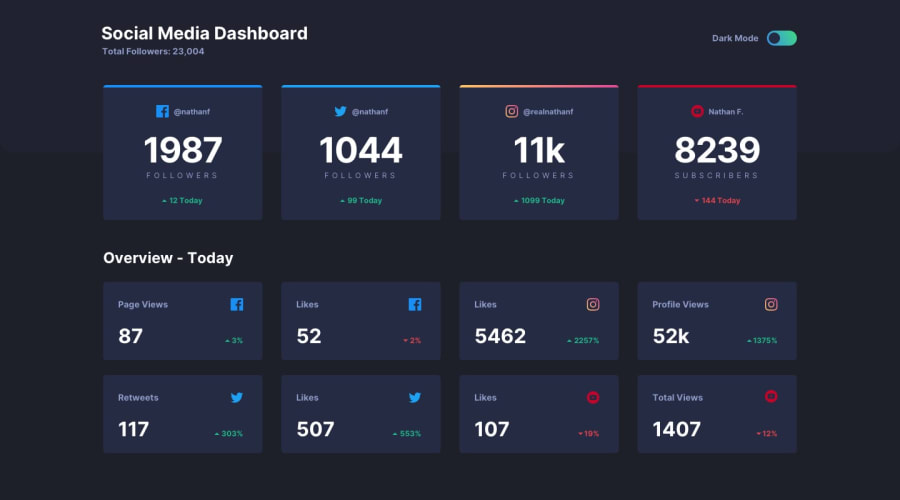
Mobile-first social dashboard with theme switcher, using CSS grid
Design comparison
Solution retrospective
Fun challenge, was the first attempting a theme switch too! A few questions:
-
I included the themes as classes which apply to the body when the switch is toggled. Would using an 'html[data-theme]' be more efficient or is it more preference?
-
Is there a more efficient way to store user preferences for themes than local storage?
-
Any improvements to accessibility you might notice in my code?
Thanks for looking! Hope you like it!
Community feedback
- @shashreesamuelPosted over 2 years ago
Hey good job completing this challenge
Keep up the good work
Your solution looks great however I think that the content of the website needs some margin from the left using
margin-left.I hope this helps
Cheers Happy coding 👍
1@CallMe-ALPosted over 2 years ago@TheCoderGuru Thanks for the feedback and compliments! Your projects look great as well. Hope to see you across this site some more!
0
Please log in to post a comment
Log in with GitHubJoin our Discord community
Join thousands of Frontend Mentor community members taking the challenges, sharing resources, helping each other, and chatting about all things front-end!
Join our Discord
