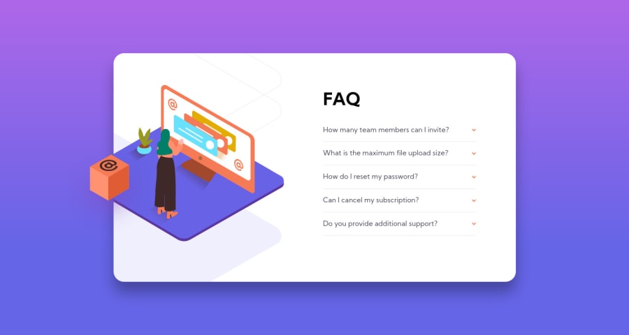
Design comparison
Solution retrospective
Hello 👋
This is my solution to the challenge. I would like some feedback on:
- The padding on the white container expanding on both up and down direction when the accordion item expands, is there a way to constraint this to only expanding the bottom?
- HTML, i try to write the markup by using
article
, is it good or should i usesection
instead, or maybe just purediv
with class is okay? - Anything that maybe i should improve or change in my code.
Thank you 🙏
Community feedback
- @grace-snowPosted over 3 years ago
Hi,
Functionally this works great and looks really good (image is a little cut off at the top on mobile, that's all)
You do need to make some changes to the html markup though
-
The accordion question div needs to be a button. Its a clickable item so should always use a natively interactive element to be accessible. I wouldn't be able to use this on my desktop as I am a keyboard user, for example (once it's a button, add a visible focus state too)
-
The labels should be spans. That's not what the label element is for. It is a semantically meaningful form element (to label inputs)
-
I'm afraid articles are definitely not appropriate for these questions as you have the markup now. Articles are for standalone sections of content - content that would have at least one heading if not more. They are used quite heavily by screenreaders to navigate a page. I would use a div to wrap these. This whole challenge could be a section (element) on a webpage but as it is the only content on there at the moment (main) I don't think there's any reason to put it in a section.
I hope this helps ☺
1@agusthasPosted over 3 years ago@grace-snow I see, i was fiddling around in responsive mode on Firefox and it looks good on Iphone X size and i literally forgot about phone smaller than that 😅 though I managed to fixed it by adding some margin on top so the image doesn't go off the screen.
Also thank you for the feedback on my markup, I mainly use my mouse to navigate and forgot that web also have that keyboard ability to navigate. For the
label
, I changed it tospan
. For thearticle
andsection
, I replace it todiv
+ class names.Thank you for your feedback, i really appreciate the markup feedback, since its my weakest still and I'm currently improving.
0 -
- @pikapikamartPosted over 3 years ago
Hey, great work on this one.
Regarding your queries.
- Yes you can avoid that and I also see a lot of submission with that problem. To fix this, you need to add a
max-height
in yourfaq__content
selector and then adding aoverflow-y: scroll
to it. So that even if a user clicks multiple accordion, the size of the container it self will be capped because of themax-height
and anythin that is cut out, will be available to be seen via theoverflow-y: scroll
. But by doing this, there will be a scrollbar, to remove this, simple add this one, just change the selector.
.example::-webkit-scrollbar { display: none; } /* Hide scrollbar for IE, Edge and Firefox */ .example { -ms-overflow-style: none; /* IE and Edge */ scrollbar-width: none; /* Firefox */ }
That is from w3schools.
- Well for, think semantically. You can use any element for it, but, doing that will sway you away from semantic markup. You use article where there is a lot of text, like a blog. Sections, well, use them when there are different sections of a component, which makes sense when you grouped those components or elements together. For example a book, there needs to be section for introduction as well as the main right.
Well I think that your solution resizes well and that is good. The layout in desktop and mobile view is really good, spot on for that one. Overall, you did a good job in here^^
1@agusthasPosted over 3 years ago@pikamart I was setting max-height before but it didn't work as i expected and i was not familiar with overflow (i mostly use overflow just to hide something so i don't really know other than that 😅) but i will keep your feedback for the next projects/challenge.
Yeah, I changed
section
andarticle
into justdiv
+ class names for this challenge since it's not a big website where i might need to createsection
orarticle
.Thank you for the appreciation & feedback!👏
0@pikapikamartPosted over 3 years ago@agusthas Your welcome on that, I too before uses only overflow to cut things out, but I found that you can make things different with it, a bit of a hack right ^^
0 - Yes you can avoid that and I also see a lot of submission with that problem. To fix this, you need to add a
Please log in to post a comment
Log in with GitHubJoin our Discord community
Join thousands of Frontend Mentor community members taking the challenges, sharing resources, helping each other, and chatting about all things front-end!
Join our Discord