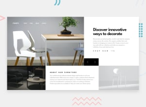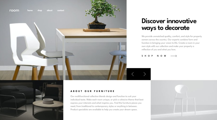
Design comparison
SolutionDesign
Solution retrospective
Is there a more efficient way to switch the content? Should a tablet layout look like the mobile layout or the desktop layout?
Any feedback and suggestions is appreciated!
Community feedback
- @ApplePieGiraffePosted over 3 years ago
Hello there, Danielle S.! 👋
Nice work on this challenge! 🙌 I think your solution responds well! 👍
A few things I suggest are,
- Using a
<button>element to wrap the mobile menu icon (since it is a button) in order to improve the accessibility of your solution. - Adding
object-fit: coverto the slider image in the desktop layout to make sure that it is clipped (not stretched or squeezed) when its size changes. - Perhaps giving a fixed height to the slider section of the page so that its remains the same (and doesn't jump around) when different slides are shown. 😉
Keep coding (and happy coding, too)! 😁
Marked as helpful1@dstrickl7Posted over 3 years ago@ApplePieGiraffe Thank you so much! This is super helpful feedback. I didn't even realize you could put an image into a button element.
1 - Using a
Please log in to post a comment
Log in with GitHubJoin our Discord community
Join thousands of Frontend Mentor community members taking the challenges, sharing resources, helping each other, and chatting about all things front-end!
Join our Discord
