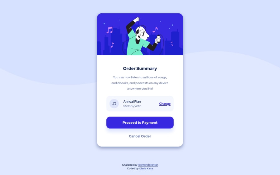
Mobile-first responsive order summary component
Design comparison
Solution retrospective
Question about html structure:
- Should two last elements (proceed & cancel buttons) in my card component be grouped into one cta section? It seems more logical to me but I have some doubts. General questions:
- Which css naming conventions would you suggest when card layout becomes really nested (e.g. container1>container2>container3)? I have read about gcp and bem, but the last one seems pretty hellish when you have to name nested children with parent prefix and it goes like 3-4 levels upwards.
- How to learn to be more precise while figuring out margins, paddings, font-sizes/weights if you don't have design assets?
- What tools/platforms could you recommend for cross-browser testing? I have found browsershots but it doesn't seem to work with netlify deployed sites.
Community feedback
- @FluffyKasPosted about 3 years ago
Hey there,
Your solution looks pretty nice and it's actually very close to the original design! I try to answer at least some of your questions and give some feedback on the rest :)
- I'd say you can group your buttons together if you wanted/have any reason to do so, but it's not a must. I did group them together when I did my solution to this challenge, as I used their container for adding some styles.
- I'm not sure what naming convention teams use in bigger, real life projects. In my personal projects I usually loosely follow BEM, only to the point it makes sense to me. As you said, it can get pretty hellish, in those cases I try to come up with a logic of my own for naming that I think I'll later find easy to follow. I think naming classes becomes easier the more you practice. And when you get hired, you'll probably be joining a team with an existing method you'll need to adopt :)
- Design assets: I never used any but with some practice I've got fairly good at eyeballing measurements. I have Photoshop open next to the project I work on and I keep comparing them. There may be some better methods existing but being able to "eyeball" things is a useful skill to have ^^
- I'm not really experienced with cross-browser testing so perhaps others can help here? I usually test my solution manually in Chrome, Firefox and Safari, plus use this website to double-check which properties are supported in certain browsers.
Some extra feedback on your solution:
- I'd recommend using <button> for buttons instead of <input>, as the latter is somewhat deprecated for this purpose. Adding
cursor: pointer
and a hover state to them is a good idea too. - Alt texts: This is a great article on writing good alt texts, you could check it out and update your alts accordingly. ^^
- You're using
width
but if you swapped it tomax-width
with a set value (rem/px) you could save yourself a media query (at the moment your media query looks a bit "jumpy"). I'd advise against using % for setting widths anyway as they keep stretching when the screen size gets bigger and may result in an overly stretched solution.
Good luck and sorry for the lengthy feedback! :)
Marked as helpful0@olesiakissaPosted about 3 years ago@FluffyKas My thanks and appreciation for such a detailed answer!
Regarding eyeball thing, I also try to always keep the designs open at some part of my screen, guess this skill just takes some time to practice :)
Also, a big thanks for details about alts and queries, I didn't use them very often, but I'll definitely research this topic. The max-width seems a really good approach and I'll try to incorporate them in the future layouts.
0 - Account deleted
I've got no base for anwering the other questions, but regarding no3, what I do is open the references in Figma and measure the elements recreating them, considering the queries given.For sure not the most optimal method, but it helps me a lot. If you use Chrome, there's also the VisBug extension that gives you some tools for examining the website itself.
Marked as helpful0@olesiakissaPosted about 3 years ago@RyukioMiyamoto Wow thanks, didn't hear about VisBug. I should definitely give it a try!
0
Please log in to post a comment
Log in with GitHubJoin our Discord community
Join thousands of Frontend Mentor community members taking the challenges, sharing resources, helping each other, and chatting about all things front-end!
Join our Discord