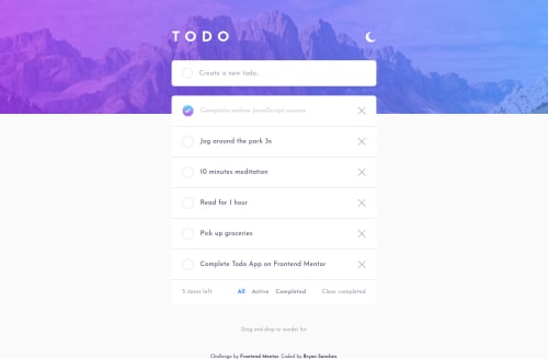
Submitted over 3 years agoA solution to the Todo app challenge
Mobile-first Responsive Design, React, Redux
react, redux, node

@0-BSCode
Solution retrospective
I definitely learned a lot with this one! Although I was able to build the functionality required for the challenge, I'm not sure if the methods I used were the cleanest way of doing so. Some points of confusion for me are as follows:
- I watched a tutorial that recommended me to create a folder for each React component and place the stylesheet for each component there instead of having one large stylesheet for everything. Although I do find this to be more organized, how can I minimize repeating myself if different components need to have the same styles? Should I use global CSS variables or is there some other technique or method that can be used?
- For the desktop design, I created a separate component (TaskInfoDesktop) to display only when the screen sizes matched those of the desktop while the component that needs to display only in mobile (TaskInfo) was made hidden. Is this good practice or is there another way to create responsive designs without having to create different components for both mobile and desktop screen sizes?
Any and all feedback is more than welcome!
Code
Loading...
Please log in to post a comment
Log in with GitHubCommunity feedback
No feedback yet. Be the first to give feedback on Bryan Sanchez's solution.
Join our Discord community
Join thousands of Frontend Mentor community members taking the challenges, sharing resources, helping each other, and chatting about all things front-end!
Join our Discord