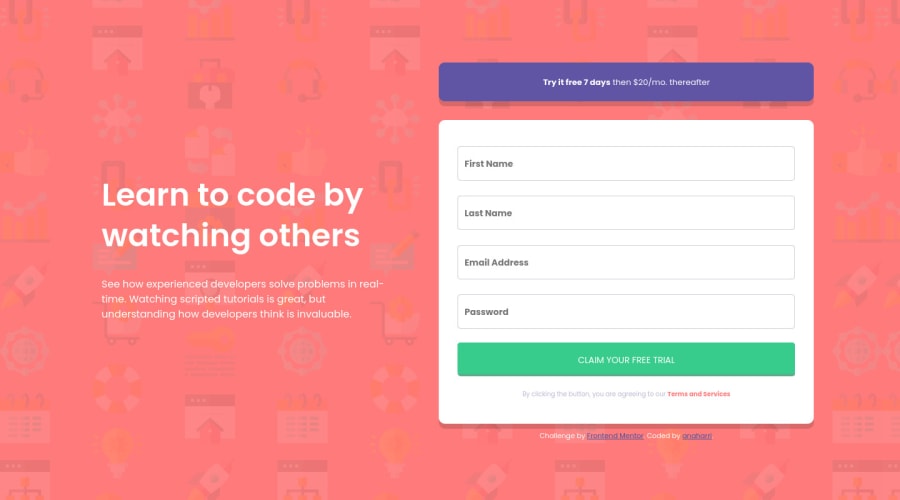
Mobile-first responsive component w/ sign up form. HTML, CSS, JS
Design comparison
Solution retrospective
I applied the changes that frontendmentor and my peers suggested
Community feedback
- @anaharriPosted over 3 years ago
Oh yeah, you're totally right! I hadn't noticed! Thank you for your feedback, I'll get right to it. Cheers!
0 - @sophiebushchakPosted over 3 years ago
This is a minor detail but I think this would improve your design a little. Right now your smaller font sizes (the ones on the text "Try it free 7 days then $20/mo. thereafter" and "Claim your free trial" ) are the same no matter if you are viewing it on a large screen or a mobile screen. On the mobile screen it makes sense that the text is small like this. But on a bigger screen it would be nicer if the text was a bit bigger. If you look at the design vs your solution too you will see that your fonts are a tiny bit undersized.
Otherwise it is a very nice solution and looks perfect!
0
Please log in to post a comment
Log in with GitHubJoin our Discord community
Join thousands of Frontend Mentor community members taking the challenges, sharing resources, helping each other, and chatting about all things front-end!
Join our Discord
