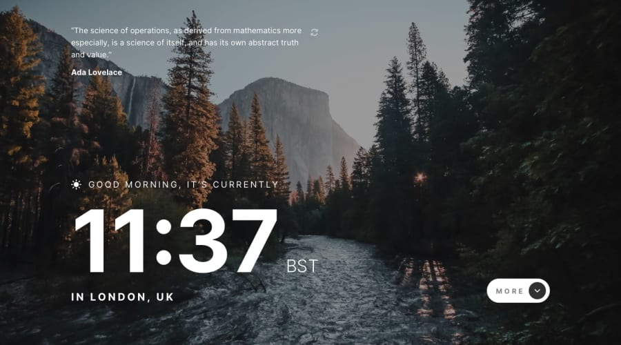
Design comparison
Solution retrospective
Need to better comment the code later and finish the README documentation. Styling this one was a bit tricky, mostly because of the timezone element. It can be wildly different lengths depending on where you're located. My timezone is fairly long, so I'm hoping it looks good for everyone else.
Community feedback
- @sergioreynosoPosted over 2 years ago
Hi Spencer, good job in with the project, looks very clean. Here is my feedback:
• The page lacks a preloader, I noticed a delay in the css rendering when I tested it on a slow connection. The quotes also lag when I refresh them. Test it out for yourself https://www.browserstack.com/guide/how-to-perform-network-throttling-in-chrome
• It would make for a better user experience if the more button was completely clickable. I kept missing the arrow when I was trying to expand the bottoms panel.
• I think this would be a good opportunity to practice your animation skills. Why not have the bottom panel slide up as it pushes the clock and quote up? ;-)
Hope this helps. Good luck!
0
Please log in to post a comment
Log in with GitHubJoin our Discord community
Join thousands of Frontend Mentor community members taking the challenges, sharing resources, helping each other, and chatting about all things front-end!
Join our Discord
