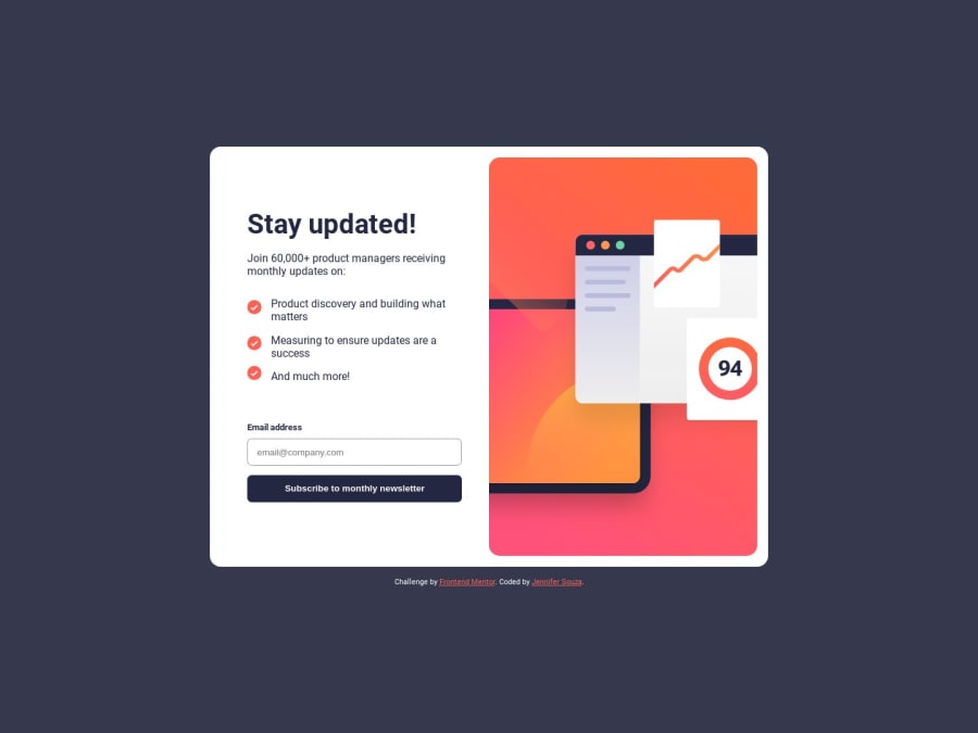
Mobile-first newsletter signup form solution using CSS grid and JavaSc
Design comparison
Solution retrospective
All feedback welcome. Thanks!
Community feedback
- @NehalSahu8055Posted about 1 year ago
Hello Coder 👋.
Congratulations on successfully completing the challenge! 🎉
Few suggestions regarding design.
-
Don't use
marginsto center the container here as it will not dynamically center the card. -
To properly center the card
-
USING FLEXBOX
body{ min-height: 100vh; display: flex; align-items: center; justify-content: center; }- USING GRID
body {
    min-height: 100vh;
    place-content: center;
    display: grid;
}
I hope you find this helpful.
Happy coding😄
Marked as helpful0@zoedarkweatherPosted about 1 year agoHi @NehalSahu8055 ! You're the second person here to try and help me vertically center things. Are the designs supposed to be vertically centered? I missed that. I think because I'm mostly coding these in my spare time on my laptop. I need to use my big monitor instead! :-D Thanks for calling my attention to this.
1@NehalSahu8055Posted about 1 year ago- If you are using Windows use
Ctrl+Shift+Ion Mac useOption + ⌘ + Ito open the developer tools on chrome then click on second field of dimensions on the top, change it to something like5000you will see if your card is vertically centered or not. - You don't need monitor for that even I am making designs on laptop only.
0@zoedarkweatherPosted about 1 year agoThank you but dev tools won't help me see better. Using my monitor will. :-D @NehalSahu8055
0 -
Please log in to post a comment
Log in with GitHubJoin our Discord community
Join thousands of Frontend Mentor community members taking the challenges, sharing resources, helping each other, and chatting about all things front-end!
Join our Discord
