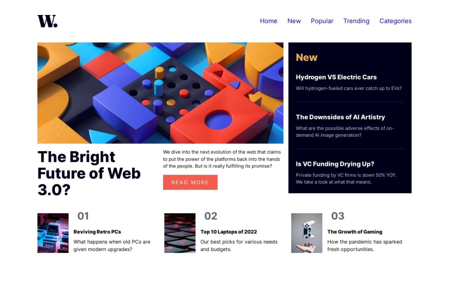
Design comparison
Solution retrospective
Hello Frontend mentor community! :)
This was a challenging project for me, but it was also a lot of fun. I struggled with getting the layout right, and while I don't think my approach was ideal, I managed to create a design that I'm happy with.
-
Looking at my code now, I realize that it's messy and needs some work. I followed a tutorial by Kevin Powell (he was working on another project) and tried to incorporate his overall approach to the project (using variables and utility classes and so on..), but I felt overwhelmed and just wanted to make the project work. As a result, there are a lot of unnecessary things in my CSS, but I plan to refactor it later.
-
As I typically do, I started this project with a mobile-first design approach. However, because the layout was more complex than my previous projects, I encountered some** difficulties in overwriting the mobile max-width with media queries**. It took some time to find a solution.
-
I need to better organize my code and make it more DRY, but I'll save that for later.
-
Currently, my solution is smaller in height than the design, and it's not centered on the page. I believe adding a container that encompasses the body and main elements and centering that container will fix this issue.
I began teaching myself HTML and CSS approximately three weeks ago, and my primary objective is to complete all of the projects. Last week I finished the last Newbie project and this is my second Junior one. My intention is to enhance my skills in HTML and CSS to the fullest extent possible before progressing to more complex projects involving complex JavaScript. I invite you to join me on this journey as I continue to solve more challenging projects. As of May 10, 2023, I have successfully completed 2 out of the 29 available Junior projects.
Community feedback
- @lack21Posted over 1 year ago
Great job 👍, but I have a suggestion!
- Remove this
html, body { height: 100%; }htmlandbodyby default will take maximum space available, soheight: 100%does nothing here, but if you want to feel secure I recommend you to addmin-height: 100vh, like thisbodyalways will be either100vhin height or more, but never less than100vh!Marked as helpful1@zsoltvarjuPosted over 1 year agoThanks a lot for your comment!
You are totally right. It is a part of the pre written reset i use in my every project and i have to admit it a always leave it like that. Gonna play with min-height 100vh i used it already but forgot to add here.
Thank you and happy coding! :)
1 - @Tjay05Posted over 1 year ago
Wow, such a nice job you're really a fast learner but your hamburger icon looks big and its not really responsive because as I'm enlarging my screen some sections are overlapping and not really taking positions
1@zsoltvarjuPosted over 1 year agoHey, thanks a bunch for your comment!
I checked it, and you are right in both cases. I am taking notes, and when I return to this project, I will change them. Regarding responsiveness, I tried my best. My problem is that I don't really know where to put items when lowering or increasing the resolution. For example, if two items don't fit in a row, how do I put one of the items in the second row? will it fill the entire row or only half of it? It's hard to explain, but I tried to play with the maximum widths of items, so they look better at 670px for example, and so on. I think it's mainly a problem with my creativity. :D
Thanks once more, and happy coding!
0
Please log in to post a comment
Log in with GitHubJoin our Discord community
Join thousands of Frontend Mentor community members taking the challenges, sharing resources, helping each other, and chatting about all things front-end!
Join our Discord
