Submitted over 5 years ago
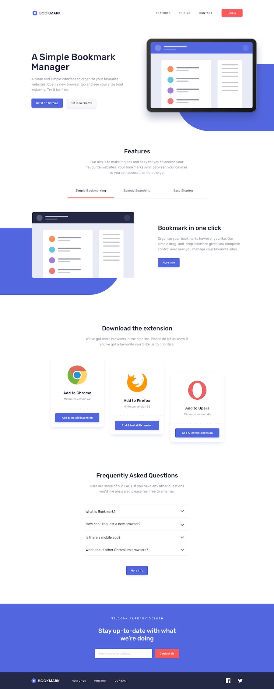
Mobile-first Landing Page -Vanilla JS, Sass, BEM, gulp
@gramme01
Design comparison
SolutionDesign
Community feedback
- @mattstuddertPosted over 5 years ago
Awesome work on this channel Emmanuel, you've done a really good job!!
The only thing I'd really add for how you could improve your HTML is that instead of using empty
divelements for the background shapes, you could instead use pseudo-elements in your CSS. This would remove that HTML code and mean you're not adding unnecessary elements to the DOM.That's a really minor point though. Keep up the great work!
0
Please log in to post a comment
Log in with GitHubJoin our Discord community
Join thousands of Frontend Mentor community members taking the challenges, sharing resources, helping each other, and chatting about all things front-end!
Join our Discord
