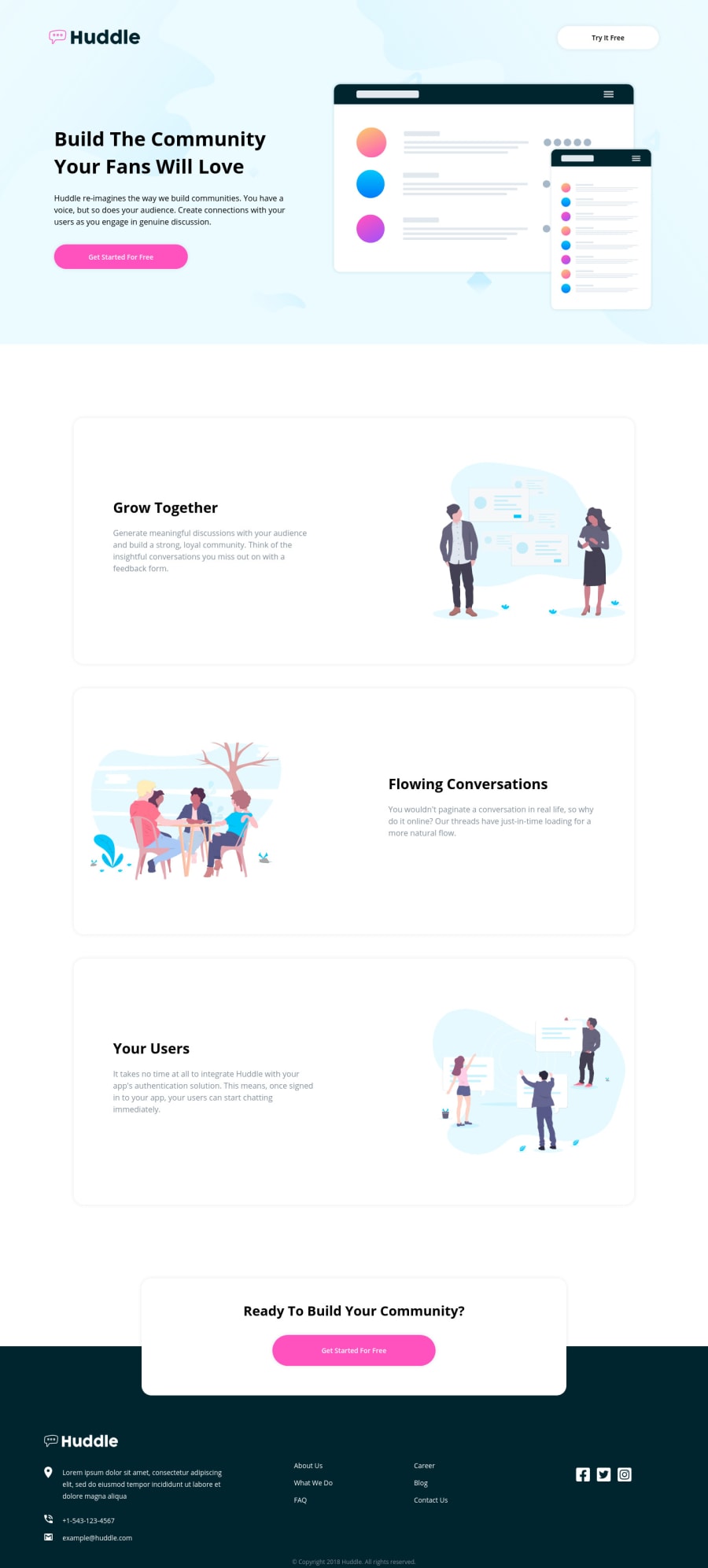
Mobile-First Landing Page: HTML, CSS, ACCESSIBILITY (ROLES)
Design comparison
Solution retrospective
Hi Devs!
I intentionally used CSS directly because I learnt how to use CSS variables and I wanted to practice it.
Please give me feedback on the following:
1.) My implementation, does it look professional and can you rate it over 10? 2.) I made use of roles in my HTML for accessibility. Kindly give me feedback on how to improve my accessibility game. 3.) Review my responsiveness 4.) Check my CSS media queries.
Thank!
Community feedback
- @ApplePieGiraffePosted over 3 years ago
Hello, Folarin Akinloye! 👋
I think you've done a very good job on this challenge! 👏 Your solution looks good and responds well and your code looks pretty semantic and organized. 👍
These are just super tiny, picky suggestions, but I would leave a little more padding around the sides of the page until the mobile layout (e.g., 400px-500px or so) so that there's a wee bit more room around the content of the screen in the tablet layout.
And I think you could place the main
<header>tag outside the<section>tag (since putting it inside the<section>tag isn't necessary and the<heading>tag should be fine as its own standalone element, I think). 🙂That's really about it. Nice work, once again! 👍
Keep coding (and happy coding, too)! 😁
1
Please log in to post a comment
Log in with GitHubJoin our Discord community
Join thousands of Frontend Mentor community members taking the challenges, sharing resources, helping each other, and chatting about all things front-end!
Join our Discord
