MobileFirst -- Interactive Rating Component
Design comparison
Solution retrospective
Plain and simple Javascript coding.
Community feedback
- @mraditya1999Posted over 1 year ago
Within the context of the
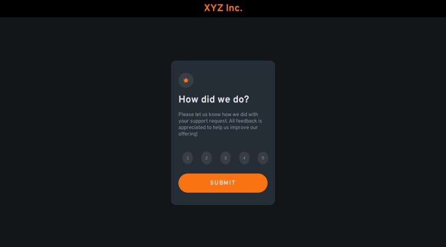
.numbersclass, consider applying a refined approach by utilizing height and width properties in conjunction withdisplay: flex,justify-content: center, andalign-items: center. This strategic combination serves to precisely center the content both horizontally and vertically, culminating in a harmoniously balanced arrangement.Marked as helpful1@MartinXCVIPosted over 1 year agoHey, @Aditya-oss-creator, thanks for the feedback. I'll improve it and update soon. 🤙🏻
0 - P@JIH7Posted over 1 year ago
Overall looks good and functions as it's supposed to! One pretty glaring thing is the number buttons are ovals instead of circles. I would give them a height and width in ems to ensure they stay nice and circular. Fixing that would go a long way as otherwise the implementation is strong and responsive.
Marked as helpful1@MartinXCVIPosted over 1 year ago@JIH7 Thank you! Yeah, I'll improve it and update it in some minutes. Setting width and height will surely work better for the circles. 🤙🏻
0
Please log in to post a comment
Log in with GitHubJoin our Discord community
Join thousands of Frontend Mentor community members taking the challenges, sharing resources, helping each other, and chatting about all things front-end!
Join our Discord
