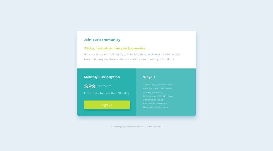
Design comparison
Solution retrospective
I originally downloaded this one over a month ago, I felt stuck on so many things, but came back to it after learning a lot more and I'm really happy with how far I've come. I found grid and the media query easier than expected, but found it difficult to get font-sizes etc to match the design for mobile and desktop. Any feedback is welcome, and any tip for using sass - not sure if there is more that I could have done other than colors? Should I have more than one media query?
Community feedback
- @AgataLiberskaPosted about 4 years ago
Hi Rachael! Well done on this challenge, I see no issues :) In this case one media query is all you need, but that will depend on the design :)
I also like to set variables for font weights, font family (especially if there is more than one throughout a larger project, I don't want to have to copy it over multiple times). I also use variables for breakpoints if I don't use a mixin - but then I nest media queries inside each class separately, so it makes more sense. Basically - if it's a value that reoccurs throughout the design (like padding/margin) or something that I'd have to constantly double-check to make sure I get the value right, I will probably put it in a variable.
Hope this helps :)
1 - @RMK-creativePosted about 4 years ago
Thanks for the feedback and tips Agata :) I'll keep using sass for smaller challenges and build my knowledge, I can see now the benefit of using it on larger projects!
0
Please log in to post a comment
Log in with GitHubJoin our Discord community
Join thousands of Frontend Mentor community members taking the challenges, sharing resources, helping each other, and chatting about all things front-end!
Join our Discord
